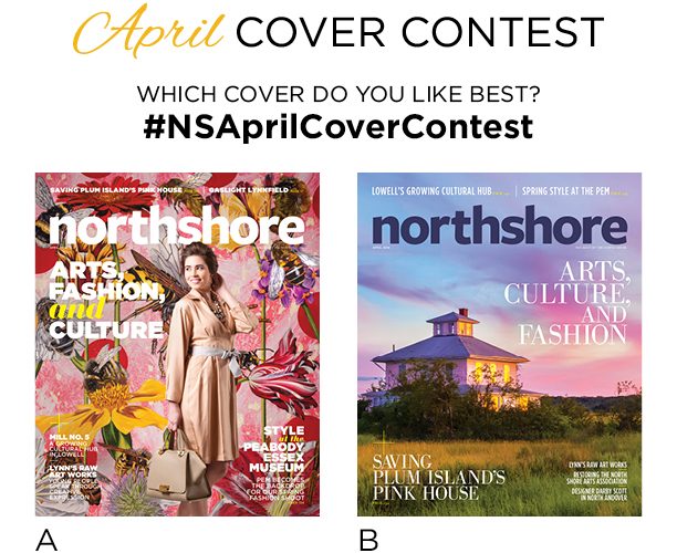

Our April 2016 Arts, Fashion, and Culture issue is bursting with creativity…starting with the cover! We asked you which April cover you loved more…and the winner is: the scenic landscape cover featuring Plum Island’s Pink House!
Thanks for weighing in with so many great comments. Here is what some of you had to say about both covers:
Option A: Florals & Fashion?
Color, design, and style all in front of great Art!
Cover A better matches the theme of the issue.
This engaging and colorful cover totally stands out as fresh and unseen before… I would pick this copy up and read every page!
I vote for the florals and fashion cover because it is shot so beautifully. It is almost like an optical illusion. Every time I looked at it, I saw something new. This compelled me to return to “un”cover a new item!
Beautiful, eye catching colors and patterns! This cover feels fresh and inventive!
I honestly love both! Florals and Fashion seems to fit better with the theme of the issue, and it is super eye catching. Love the background.
It’s busy, bold, and beautiful! Very different from what your cover generally portrays. It really caught my eye!
After a long New England Winter, I love to see the colors of Spring, absolutely stunning cover.
One, it’s beautiful. But two, it perfectly reflects the theme of the issue.
Everyone has a good photo of a sunset on their phone. Option A is different, more professional in my opinion – has that immediate appearance of a major magazine like Glamour or InStyle. Option B could be used at any point in the year.
Given the subject matter, I prefer Florals & Fashion because it better represents the material. However, if the subject matter was different, I’d prefer Scenic Landscape.
As much as I love the “Pink House” and the story behind it, I think the floral cover speaks to Spring much better. It’s bright, fun, and after Winter, this is the “pick me up” that most of us need!
More complex.. the visual makes you want to look at it more closely and the words draw you in to see why it’s Arts, Fashion, AND Culture. The other cover looks exactly like one of those ubiquitous free “What to do on the Cape” (or North Shore, etc.) publications.
More colorful and fashionable
For a spring cover, it catches my eye. Very bright and colorful!
I almost went with B, it’s such a nice shot of the pink house – but I like the tie in with the PEM, gives a sophisticated edgy feel to the magazine.
The scenic landscape is gorgeous but I think the florals & fashions cover fits the description better.
I love the photo of the house…BUT the lead ad is about “Arts Fashion and Culture.”…that tag line suits the model and Spring flowers more appropriately…the flowers are beautiful and I think people are ready for SPRING! So….I vote for the model and the flowers as the photo and message are aligned. Nice job! 🙂
Its vibrant, fresh, and exciting…just like spring should be!
Because an edition that focuses on fashion should show fashion, not a beautiful landscape…and I LOVE that handbag!
This cover just pops and catches the eye more quickly than option B! It’s bright, cheerful, colorful, and screams SPRING!
What if you did a dual cover issue? Or have option A as the front cover and then in the middle of the magazine have option b as another cover, like an insert. Just food for thought!
Spring needs to be full of glorious colors after the dead of winter!
The A option stands out as a unique cover. While B is beautiful and serene, it looks like it could be any cover, such as a travel section insert in the Boston Globe or other such publication.
From my perspective the Northshore magazine brand is lively and modern. There are too many regional magazines that just stick with landscapes and the coastal vibe, and although this landscape photo is especially lovely- it doesn’t grab me as a great cover image. The other issue I have with Option B is- you are selling Art, Culture, and Fashion with a historic landmark photo- it just doesn’t fit right to me. There is a great optimistic feeling from option A that is appropriate for a spring issue. That’s my two cents!
It speaks to me!
The fashion floral cover depicts a shopper… Good for retail establishments. There is also an urban appeal… While the beauty of the landscape is clear it conveys a sense of isolation rather than participation. It is almost too predictable.
Option B: Scenic Landscape
Every time I pass this beautiful old house on my way to Plum Island, it makes me think of a peaceful time gone by. This cover is soothing yet exciting and it makes me feel good!
Plum island always reminds me of home. The way it matches the skill is phenomenal.
I fell in love years ago with the “pink house” and truly enjoyed seeing this beautiful photo on your April issue!l
It’s simply a spectacular photograph embracing not only this house, but the look and feel of our beautiful North Shore coast.
It is a beautiful photo, bringing the promise of summer and beautiful seaside days.
Mesmerizing and simple.
A is so busy it hurts my eyes. I would NOT be attracted to it on the newsstand.
I love the beautiful colors on the cover. I vote for B.
“B” is beautiful and would look lovely on my coffee table. “A” is busy and clashes with my living room decor.
This looks peaceful.
Love the simple elegance of the house v the fashion shot in which I find nothing appealing.
Besides being an incredibly gorgeous photograph, the Pink House is near to my heart and home as a year round artist and resident of Plum Island. It’s a much more meaningful & appealing cover shot & story. Flowers are overrated and overdone in spring but the Pink House is a standout. Looking forward to seeing it in April.
Shows the natural beauty of the north shore. Calming photo.
So much color in the background of cover A that you’re eye tends to lose the model and her clothing
Love Plum Island and also have received your mag for ys…..hopefully my issue for April will be the Pink house…Thanks
I like the simple yet elegant landscape. Makes me want to be there.
I live in Newburyport but love Plum Island, its a very special place for me, and often drive by the pink house, and often what will happen to the house, I’d like to learn more
I don’t like the model’s dress on A
The Floral & Fashion cover has it’s place but, in the larger context, the Scenic Landscape id more emblematic of the North Shore
I found the photograph of the pink house to be artistic, mysterious, beautiful, and it made me curious to find out more about it. The fashion cover was too ordinary and uninteresting. It reminded me of just another fashion magazine.
“B” is beautiful and would look lovely on my coffee table. “A” is busy and clashes with my living room decor. (I didn’t receive my paper issue yet!)
I have loved this house. My family lived in Newburyport for several years and went to Plum Island often. Every time I saw the house it made me feel happy.
Although they are totally different covers and beautiful in their own way, my favorite is “B”. I love the colors of the sky. It’s such a serene picture and a beautiful picture of the “pink house”.
The amazing colors in the sky tie in beautifully with the Pink House! The suns reflection in the windows captures your eye! Fantastic!!
I love the scenic landscape which really captures the natural beauty of the North Shore. The fashion shot, beautiful as it is in its own right, could be on any fashion magazine, in my opinion.
It really offers a feel of peace and tranquility all while bringing in the focal point
It’s visually more captivating and, as a native of the area, I know this landmark to be iconic and will certainly capture the attention of a broader audience (both male and female).
Less cluttered. The landscape is an invitation to visit, to come in. A new world to be explored. Makes me curious about what I might read in the publication.
I drive by the pink house a lot and just love how it just sits on that area on plum island surrounded by all the beauty of the marshes around it. I fully enjoyed your article on the pink house I learned a lot. I believe that nature gives us such beauty all around us and we are so busy we do it stop and fully open our eyes to it. Some people would say this is a broken eye sore , I see the beauty of it and imagine who lived there snd the life that house had seen.
It’s so beautiful and it makes you long for summer days on the beach. Pink is also my daughter’s favorite color!!!
Take the model out, of the beautiful art background. She does not belong there.
I received the florals and find it very busy. The landscape cover is not only beautiful; it is also peaceful.
The first time I saw the pink house I was immediately drawn to it! Mesmerizing !
Pretty! Haven’t done a landscape before
As an avid runner and lover of all things historic in Newburyport, I first fell in love with the pink house 6 years ago on a run from my house out to Plum Island. I reach it at mile 2 and just the essence of it keeps me smiling and running along beside it! Depending on the time of day, it can look so different. If I’m doing a long run, I’m lucky to see it twice!….once on the way out, then again on the way back. It’s a beautiful sight to behold. I’m grateful to live nearby and to see this historic home in all it’s majesty. I find myself creating stories in my head as I run, about the people who lived there and maybe some wonderful parties they had! Thanks to all those who are trying to save it!! AND Thank YOU at Northshore Magazine for giving this old beauty time on your cover!!
I LOVE the pink house. I can’t wait to read the article- I,ve been driving past it for years wondering what the story was with this house. Plum Island is my closest “get away” location- and just crossing the bridge always gives my spirit a lift. And , there is the pink house
Surrounded by big marsh and big sky. (option A is too loud and too busy.)
Looking at it makes me feel peaceful and relaxed. It is a beautiful scene.
The colors are just beautiful! It’s very calming yet intriguing,it kind of draws you in. Makes you want to look at it and yearn for a day at Plum Island.
Beautiful pic!
Cleaner lines…less busy…soothing color palette
The landscape photo of the pink house catches my eye immediately and makes the wording on the cover more prominent. The florals and fashion cover is pretty, but feels too congested and busy. And this landscape photo really represents the Northshore to me!
“B” is beautiful and would look lovely on my coffee table. “A” is busy and clashes with my living room decor. (I didn’t receive my paper issue yet!)
I’ve always loved The Pink House, in every season. That frock on the other cover is hideous.
A perfect summer evening on Plum Island – what could be better??!!
Iconic house. This house actually adds interest to the marsh around it Old houses tell stories and I would hate to see this story end.
Iconic house. This house actually adds interest to the marsh around it Old houses tell stories and I would hate to see this story end.
As much as I love fashion, I’m partial to the pink house on Plum Island. It’s an icon and it makes a beautiful and serene cover 🙂
The floral cover is too busy and the model almost disappears in it. I love the pink house! A sight I have enjoyed on trips to Plum Island.
We travel to our daughter’s home on Plum Island frequently and pass the Pink House. It’s an iconic treasure that should not be allowed to deteriorate. We often imagine the many years the house was active with people enjoying the beautiful sunsets.
A is too busy. B is inviting and you can view the ocean in the distance.
I love how still the image is! The natural beauty is intrinsically beautiful and the picture stills my mind and brings a smile to my face.
You just can’t beat a sunset , especially the infamous pink house.. it poses as what New England is.. not a fashion shoot with a model
I find the classic New England home framed by the beach grass of the Plum Island dunes to be very inviting. North Shore Magazine covers always grace our family room coffee table.
Saving this house is important right now. The other things, while lovely, are not urgent.
Love the aura of the Pink house
It’s an iconic photo representing the best of what makes the North Shore so special.
First I just love the pink house ! My friend is a photographer, she just took a picture of this house last fall. I was so taken with it and here it is again. Wonderful 🙂
Ultimately the Pink House is an important Icon and the image less frivolous than Option A.
I think the scenic landscape is more serene, less busy, and just such a beautiful example of why living in New England is such a wonderful experience.
It is cleaner, easy to read & Saving Plum Island’s Pink House is prominent. It gets lost on Cover A and the items included in edition are not easily readable on A, they get lost in the busy background.
While the floral cover may better reflect the theme of the issue, the photo of the Pink House is simply beautiful. It is calming and easy on the eyes while the floral is busy, busy, busy.
The florals & fashion cover is very busy. The white text/font is difficult to read.
Cleaner, more sophisticated look and easier to read the type over the image!
Option A is too busy, using a model on the front makes it look too similar to a lot of the woman’s magazine, plus it has no connection to the North Shore.
I love the design. The choice of colors are perfect with the pink cloud background and purple hues. The scene is not cluttered. It’s simple and clean. I grew up on plum island and passed the “pink house” every day. Such a gateway landmark. Let’s save it.
I love the design. The choice of colors are perfect with the pink cloud background and purple hues. The scene is not cluttered. It’s simple and clean. I grew up on plum island and passed the “pink house” every day. Such a gateway landmark. Let’s save it.
Option A is TOO BUSY
Less busy, more beautiful – it’s more what the North Shore is about…
I love both, but the second one; scenic, represents North Shore.
I’ve often photographed the pink house and think it should be saved
As it invites you inside it’s cover, it’s bringing me into a place of serenity, where knew things can be experienced and old things can dissipate. #TheWonderousPlaceTheyCallSpringWhereNewBeginningsStartandOldThingsFadeAway
Because word needs to get out about the pink house and we must all do what we can to save it
Cleaner, much more attractive, fonts more appealing.
Florals and fashion is WAY TOO BUSY. love the gorgeous shot of the Pink House. Beautiful, local icon.
The pink house is an icon. Cover A is too busy where B is serene.
I live near the pink house and see it on our jaunts to plum island. We hope to see it saved!
I love seeing the pink house on plum island. Sad to hear that they are thinking of destroying it.
As a cover, beautiful scenery is always more eye catching in my personal opinion. Plus it will attract more attention to the pink house’s plight!
The Pink House hands down! Always place on the cover of Northshore magazine something that is iconic of the area! I was disappointed to receive the cover with Florals & Fashion… A young woman swathed in a pink coat that could have been on the cover of any fashion magazine.
The Pink House is an institution, a part of Plum Island folklore and landscape that simply cannot be replicated!
I so want to know the back story to this colorful house; that being the divorced woman who had it built and painted it “Plum Island Pink!”
Natural beauty can only be captured by certain artists. Photo B is captivating not just by the photographers ability but the natural surroundings bring out what the artist wanted captured
Reminds me warm weather and beautiful sunsets are on the horizon!
I love seeing the pink house on plum island. Sad to hear that they are thinking of destroying it. As a cover, beautiful scenery is always more eye catching in my personal opinion. Plus it will attract more attention to the pink house’s plight!
I grew up in the Pink House
I lose the woman. She almost disappears because she Does not stand out.
This picture represents what the North Shore is about and is a welcome sight to get us ready for Spring.
I like the scenery of the North Shore
The cover featuring the Plum Island pink house is anesthetically pleasing and transports you a balmy summer night leaving the beach.
Love a photo of a classic North Shore destination, like the Plum!
Both covers are good; the picture of the Plum Island pink house is awesome. It catches the feel of the island on a lovely warm evening and transports us there. Such is the power of outstanding photography. More of such, please.
Iconic, historic, brings back so many memories
N.E. landscapes are beautiful; especially the pink house in PI that you are showing here.
It is such a peaceful and colorful photo
Iconic “spite house” that has a rich heritage and is stunning in varied shades of pink depending upon sun and weather.
Its beautiful!
The florals and fashion cover seems too busy; it’s quite difficult to even read the words printed over the floral pattern. The scenic landscape, however, is stunning and clean. It’s a truly eye-catching magazine cover!
I think the Plum Island landmark is iconic. Reminds me of all that is beautiful in the North Shore.
This image has become an icon depicting a unique charm and narrative and sense of place and holds the potential of becoming a mirage for many of us d/t the uncertainty of its future.
The “Pink House” is an iconic image representing the North Shore. The floral/fashion cover is too generic.
The Scenic Landscape embodies the beauty of Newburyport/Plum Island: calm, uncluttered, and real. The Floral one is generic and isn’t personal enough, it feels like a stock photo. Newburyport is unique with lots of character; the Landscape photo does it for me!
the sky colors, the interesting shape of the home, my love of beaches
This old pink house sits alone in her aged, tattered splendor, home only to a snowy white owl who knows her stories. She no longer tries to impress and her only beauty comes from having absorbed years of sunset wisdom that radiates to all even on the gloomiest of days. We should do so well! And the photographer has captured the essence of this iconic Plum Island house.
Floral and fashion are generic. I could be looking at Seatle Washington.
It captures the beauty of the north shore
I love the colors of the sky reflecting over the house on Plum Island. Beautiful!
It’s a beautiful photo with a real cause behind it. That house is a landmark!
It’s a gorgeous photo that screams “beauty on the North Shore”. This pretty pink house from a different era has a lot of mystique and sentiment to people that are familiar with it.
I, myself have taken many photos of the pink house. Its a favorite to all photographers, and paintings..
Ties in both PI and Newburyport; evocative of childhood memories for many
The color is just so beautiful as the sky matches the house. You just don’t see this too often. Great photo capture
Its quite a striking cover, with beautiful colors. And also I particularly feel really strongly about saving the pink house, which is such an iconic emblem as you approach Plum Island.
I love the pink glow surrounding the Pink House. It speaks summer and is inviting. I like the yellow glow in the Windows.
I was born and raised in NBPT.close to the pink house. Beautiful and eerie all the same.
I love the way the light bounces off the house and the beautiful colors.
The florals and fashion cover is too busy, while the landscape leaves space for the words and fits well. Also, the landscape is too good a picture to pass up!
Stunning
The Pink House is an icon and a more unique artistic symbol.
Love Jim Fenton’s shot of the pink house. Simple, unique & stands out from other covers
It’s beautiful to drive by no matter what the weather or time of year…
The pink house is an iconic landmark on the way to PI. This photo captures the beauty of the house and of the rest of the scene. I can feel the radiating warmth of the day.
Better represents the vision of the magazine….
Better representation of what is Boston’s North Shore
Picturesque and iconic in this area. Love the colors.
I grew up riding by the Pink House everyday on the school bus and now one of my school mates, Betsy, takes pictures of a snowy owl that roosts there!
While attractive, the Florals and Fashion is too busy for me. It’s tough to find anything to compare with the beauty of Plum Island and your photo captures the warm glow perfectly.
The Pink House is unique to the North Shore. It has drawn photographers and artists from across the country. Having it on the cover of your magazine would go a long way towards saving this iconic structure.
I have been looking at this magical pink house on the way to Plum Island ever since I was a little girl. It is a landmark and means summertime to me. I can’t imagine going to the island and not seeing it there.
Everyone who’s ever driven past that house loves it
Perfect shot for this area
Everyone loves that pink house!
Pink house.. Pink sunset! What could be more naturally fashionable! Stunning!
The Newbury Pink House really represents the combination of Arts & Culture tied in distinctively with the North Shore.
It is a beautiful landmark of Plum Island.
I have loved visiting Plum Island for years and while I hope the Pink House will be saved I think it will be a difficult fight. I did not know the history of the house and now have made a point to learn more about the Spite homes. I like both photos but LOVE the Pink House. Thanks
LOVE the pink house!
Iconic image, house at the gateway to Plum Island. In danger of being lost forever….
I love the color and simplicity of the photo –
Amazing photo!
It’s a Plum Island staple. For me, nature, and especially a cotton candy sky, will always win over staged shoots. –
The one on the left is too busy and hard to read. The scenic landscape is peaceful with beautiful colors, also easier to read.
The colors in this photo are breathtaking, along with the fact that this would be such a great cause if it were on the cover! This house makes the photo so unique, it certainly shouldn’t be taken down! Props to the photographer for seeking the perfect time to capture this photo and the beauty it has to offer.
We love Plum Island and it wouldn’t be the same when we drive onto the island if the Pink House was no longer there! Hopefully this cover will draw attention to this issue! Thank you so much!
Option A is too busy. Option B is calming.
It’s amazing. Breathtaking!
I love plum island, and it is a much prettier cover!
Floral and fashion can be found on many magazines, but beautiful photography is much more appealing especially with the approach of Spring
I love the coastline, beautiful architecture, and what a gorgeous sunset! The cover is much simpler yet colorful. I also like the “Northshore” logo in dark letters as opposed to the white lettering.
Because when I think of the North Shore – it reminds me of the ocean (which I think us Massachusetts residents might take for granted) that the ocean is within access and people who live in the middle of country have to spend hours getting to a body of water.
The colors of the house and the sky are just beautiful!The photography is wonderful and the colors blend so perfectly. I could hang it on my wall.
Pink House is an iconic local landmark. This particular photo is stunning. The floral and fashion option is extremely busy and unattractive. The scenic landscape speaks to the issue’s main theme of arts and culture. Love it!
With all the stress in our lives these days, this cover says “relax.” I can picture this home, on a Friday night, relaxing with friends and a glass of wine!! There are so many fashion magazines and covers…but the scenic picture speaks to me !
It’s a beautiful house on a fascinating setting. The sunrise and sunsets are spectacular. The wildlife perch on the house making it a very interesting piece of property.
Love B. It is a house I look for every night on my way home to Plum Island. It is like having a real celebrity on the Island. Not to be missed!
It is an awsome picture!
I live on Plum Island and I love this house. It is such a landmark heading out to the island. I hope they figure out something to do with it- and NOT tear it down.
The Newburyport pink house is a beautiful picture of a historic property rumored to be slated for demolition.
I love the colors in the scenic landscape image. It looks calming.
The sunlight reflecting off of the pink house’s windows and the sky are beautiful. Very inviting picture.
A is too busy. B is beautiful and says North Shore.
Beautiful shot and well-known landmark just before Plum Island. There is a large effort to save this Pink House from possible demolition! This would be a wonderful help if it graced your cover!
I FEEL THAT THE PINK HOUSE IS MORE ENCOMPASSING ON THE OTHER ARTICLES RATHER THAN JUST ONE PERSON… LOOKING FORWARD TO THE EDITION.
Love the colors and the idea of saving the pink house.
I don’t want to see people tear the pink house down…
It’s very beautiful and serene. Great shot!
I love the Pink House!
Love the Pink House; wish I’d gotten that cover…
A is far too busy
I like the idea of the Florals & Fashion cover, but the image of the model gets lost with the background.
Serenity! The other had a great background with great colors to catch your eye. But really didn’t care for the way the model was presented.
The photo of Plum Island’s Pink House at sunset is so calming! The thought of saving that house perks curiousity to read the article about it! Easy to see the other topics advertised! Spring blossoms at the sight of such beauty!
Reflects the landscape of the North Shore which is what this magazine represents.
I love this house and the photo is breath taking. Also, there is some concern that this house will be taken down and then you would not be able to capture such a beautiful scene. I absolutely love this house and numerous photos I’ve seen captured in different times of day and different structure poses.
Features an endangered icon of the area – deeper and more meaningful than flowers and a dress.
I think it better represents the North Shore, it has a calmness to it, and makes you think of comfort and home.
It’s easier to read and looks like a place I would love to be. I would be more likely to pick that up and read it. It appears more sophisticated and classic.
Composition, colors, memories! The pink house photo delights the eye and satisfies the soul – much like any day spent on the North Shore.
To let your readers know of a topic like saving the pink house will bring literary interest and more value to your magazine instead of what I always hear they see it as (a cover for selling advertisements).
B helps inform readers about saving a Plum Island landmark. The photo is stunning as well.
The landscape photo makes me wish I was there, at that house, basking in the peacefulness and tranquility of the natural beauty surrounding it. I would love to wake up there in the early morning and have my coffee, relaxing and thinking about everything and nothing! 🙂
The colors in this beautiful pic of a North Shore landmark are amazing.
This house is an icon in the North Shore area and it’s being threatened! I want to see this current local issue regarding this historic focal point in Massachusetts get some positive exposure!
The picture is amazing – much more eye catching than the wallpaper cover that seems to get lost in, well, the wallpaper. Plus, the cover story of the Pink House preservation appeals to the emotions more, especially with such an emotive photo.
It’s the Pink House! I love the colors and beauty in the picture.
I love the beautiful colors in the sky and on the lovely pink house! Very calm and relaxing!! Elegant!! Nice job!
When I think of North Shore magazine this is what I picture. Cover A looks like the magazine is a fashion magazine. North Shore magazine is a great resource, and that is what I would expect when I see cover option B.
I love the peaceful, calming, and the feeling of natural relaxation. The Plum Island, Newburyport etc. is one of my favorites.
The colors in the sky is just that awe feeling. The cover makes you want to hop in your car and head to PLum Island.
Are you kidding? A beautiful piece of architecture versus a silly fashion shot? I’ll take the architecture every time.
The florals and fashion cover is too busy. The scenic landscape is a gorgeous picture, plus it gets me in the mood for the nice weather to come!
Cover (A) is very springish and pretty, but a little too busy for me. Cover (B) Makes me really excited about the arrival of spring, and I would definitely pick up this magazine first if I were in a doctor’s office.
The first one, A, is too busy, distracting. The B option is of a neighborhood gem, whose time is limited, and the photography is spendid.
The cover drew me to it. It got my attention. Was not cluttered/busy.
Image typifies beautiful lanscapes and history of the North Shore.
Big supporter of saving the Pink House & think the exposure would help the cause.
Well, let’s see…I live in Newbury and love the antiquity and charm of an old pink house that seemingly “comes with the landscape” of the drive to Plum Island…AND…particularly because being on the cover of your popular and first rate magazine might help to make a strong statement towards the authorities not tearing it down which is heavily being considered… that would be so sad as it’s a lovely eccentric statement of old New England.
Because there is actually more art, fashion, culture, and history in option b.
B is a perfect example of classical North Shore culture. Cover A is way too busy!
The other choice is too busy, and I am a sucker for a good sunset!
The photo is captivating. If one didn’t know better.. it could be in another part of the US! It’s sophisticated while it teases you to learn more about the Pink House. With all the monthly spring fashion magazines, this issue will NOT be overlooked! Bravo! Looking forward to its arrival at my doorstep! Happy Spring and Thank you.
I think that having such a historic and loved piece of landscape on the cover is much more fitting than option A. Option B is a much more personal thing for the people of the North Shore. Also since there has been talk to tear down that pink house it seems even more fitting to immortalize it with a cover!
Love the Pink House
Because it is a beautiful photo of The Pink House! Of course!
I am part of the Save the Pink House group! Much prettier and more reminiscent of the North Shore…
The house is so important!
Fashion comes and goes. Iconic landmarks are timeless and live on as artistic subjects rich with history.
I feel like there is way too much going on in picture A.
The Pink House is an icon. It’s stood so many years, and in the perfect light still looks like a lovely house. It’s nice to think of “her” still being beautiful.
Love it! Beautiful North Shore landscape!
It is a very timely cover as this icon is big news in Newburyport and on the North Shore = the other cover is also nice maybe a bit too eclectic.
Seeing The Pink House on the road to Plum Island means we are almost there- closer to Heaven.
The Pink House is iconic on the North Shore!
The house has great history!
LOVE the Pink House!
That shot of the Pink House and the surrounding marshland, is just too beautiful not to have as a cover. The other cover is just way too busy.
Cover ‘A’ has too much color and design, very confusing to look at and can not read the highlights. Cover ‘B’ is very calming, simple, and easy to read. ‘B’ gives you a feel that Spring and Summer are on the way.
It’s a more interesting scene and topic than the run of the mill arts/fashion topic. It will also bring the story to more people.
We must preserve this iconic North Shore landmark.
Visually cleaner and more arresting. Specific to North Shore. Cultural landmark on the way to Plum Island. Save the Pink House!
It’s a great cause, a great story
The pink house brings so great memories for so many people.
The pink house is an interesting PI icon. Arts and fashion has been done to death and will no doubt be covered in other issues. Lets hear the story of the pink house!
I’ve often photographed the pink house and think it should be saved
Florals and Fashion cover is visual cacophony; The Pink house image is much stronger and beautifully serene. I also think the graphic design on Scenic Landscape is stronger.
This is a very calming and peaceful look, and someplace I would love to visit
I just love the colors of the sky, and it’s such a pleasing, calming picture.
I grew up in the Pink House – from the early sixties – and have fond memories of it. My play area was in the cupola. I am so pleased that it is finally being recognized as a landmark.
The pink house cover is so relevant… and it would attract me to buy the magazine
My feeling is that “A” would be fine on a National Magazine as it does say “spring”. But if the name of your magazine is “North Shore”, and its my opinion that you should always represent that name in some fashion…whether spring or not. Your customers buy your magazine because they’re interested in local information in “Arts, Culture, and Fashion” and many other subjects. Spring happens everywhere…the “North Shore” is YOUR audience.
‘A’ says fashion, but ‘B’ says arts & culture – 2 out of 3
Cover A is too busy for me. Cover B depicts what I love best about the North Shore; its raw beauty!
The Florals and Fahion cover looks too commercial for my taste while the landscape cover represents more of the natural beauty that the North Shore is all about. I love exploring the interesting places that Northshore magazine highlights in and around my beloved North Shore, while simultaneously enjoying the restaurants, shops, and other points of interest that you highlight in your articles about each specific locale. Please don’t “sell out”! Your magazine is far too unique and beautiful fall prey to commercialism. I have been a subscriber for many years and look forward to each issue for all that it has to offer.
They are both great (and I’m partial to anything “Plum Island”) but the florals & Fashion catches the eye and goes with the theme. This cover is exciting and vibrant making me look forward to opening the cover to see what’s inside.
Lovely blend of color reflecting the sunsets on Northshore. Floral cover too fussy. Creates chaos for the eye. And it looks like one of so many others on the news stand.
I love the colors and pattern on A, however, the model ruins it. B is peaceful, serene, and interesting.
The florals and fashion looks more like a fashion only magazine. You are a lot more than that!
Really can’t go wrong with either. I just love a good landscape!
I love that house- know it well.
I miss living on the North Shore so much and the scenic cover reminds me more of home.
Option A is too busy. I love the sky in option B.
A is too busy–can’t focus on any one thing.
A is too busy & B… seems calm and spring like.
There’s too much going on in the Floral/Fashion cover. I prefer Landscapes, minimalist with colors.
It’s not as busy as the floral which makes noticing and reading the article titles easier to see.
Landscape is much better but I would prefer a picture of Lynn….