
When it comes to home decorating, the entry can be easy to overlook. But this little space offers the opportunity to create a welcoming and interesting vignette, especially through color. Whether you’re looking to greet an important visitor or simply want to beautify your home for your own enjoyment, these six color palettes can enhance your foyer.
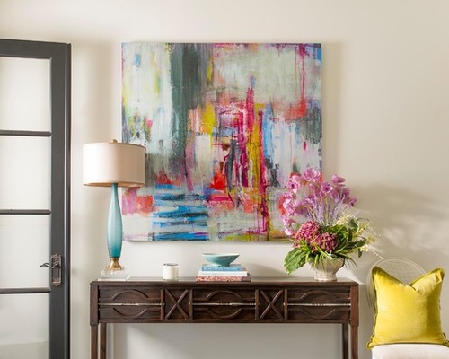
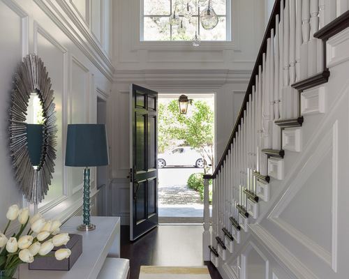
Color 1: IBB Design Fine Furnishings, original photo on Houzz
1. Blue, fuchsia and yellow. This rich palette is vibrant like a spring garden, as evidenced here in the bright and cheerful artwork. The yellow pillow, fuchsia flower arrangement and blue lamp and bowl all tie in with the painting. Dark colors in the table, door and flooring ground the room, while the white walls and chair bring an airy feel to the space and pick up the lighter colors in the art. Overall, it’s a balanced, refreshing palette.
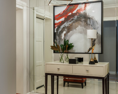
Color 2: Dina Salakhova, original photo on Houzz
2. Red, white and black. In this entryway, the sharp color contrasts featured in the abstract art add drama, while the black-and-white chest, red ottoman and white lamp augment the striking combination. The table’s clean lines keep the emphasis on the artwork while also providing a handy landing area for keys.
White Table Lamps Tat Complement Your Color Palette
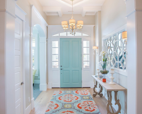
Color 3: JCD Custom Home Design, original photo on Houzz
3. Blue, orange and white. The rug’s bold color combination pulls together this entry’s palette. But it’s the blue of the front door, coupled with the coordinating hue in the ceiling medallion, that provides the biggest surprise. Blue and orange decorative items on the table add to the fresh look. The light walls, sofa table, chandelier and flooring provide a neutral backdrop.
Door color: Palladian Blue HC-144, Benjamin Moore; wall color: Revere Pewter, HC-172, Benjamin Moore; rug: Talavera New Zealand wool rug, kd spain
Color 4: Jeff Schlarb Design, original photo on Houzz
4. Gray and white, with a splash of yellow. Nothing beats fresh flowers or a plant to bring the outdoors in and add life to a space. Here, the flowers also accent the decor, picking up the white and yellow in the rug. The textural choices are also interesting: The reflective leather of the white benches mimics the reflective qualities of the wall’s wainscoting.
Chandelier: customized John Pomp fixture; console table: custom; rug: Rosemary Hallgarten
Color 5: Bonnie McCarthy, original photo on Houzz
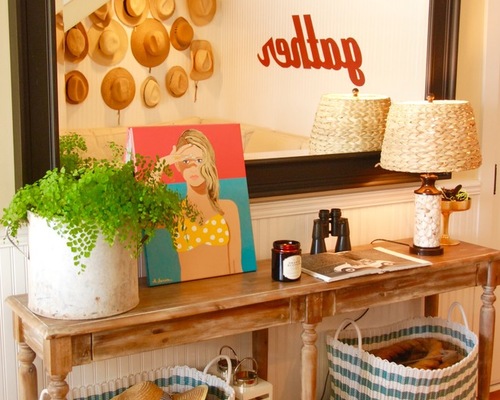
5. Blue, white and sand. Watery blues, organic white and sandy browns are a natural combination for a relaxed look. Here, the rustic table, woven lampshade and hats along the wall (reflected in the mirror) add shades of sand, while the white plant container and blue-and-white baskets round out the beachy palette.
Color 6: Corynne Pless, original photo on Houzz
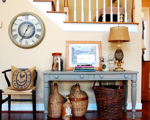
6. Cool gray and warm beige. Neutrals don’t have to mean boring, and one trick to getting them right is getting the balance of colors right. Here, introducing both cool and warm neutrals creates a tranquil scene with staying power. Given the mellow colors, texture becomes important: The baskets, burlap pillow, chair seat and lamp shade all add warmth.
Table paint: French Linen chalk paint, Annie Sloan; wall paint: Roxbury Caramel HC-42, Benjamin Moore