

This Massachusetts condo renovation was a labor of love. “My client wanted to create a special home away from home for his mother when she is here on extended visits from Atlanta,” architect Shelly Ziegelman says. He was very hands-on and had lots of inspirations and ideas, including a clever one swiped straight from the Oval Office. The result is a wide-open plan that takes maximum advantage of the architecture of the converted school building. And best of all, it’s a five-minute walk from his house, where he lives with his wife and three children.
Houzz at a Glance
Who lives here: This is home base for a grandmother when she visits her son and his family
Location: Winchester, Massachusetts
Size: 710 square feet (66 square meters); 1 bedroom, 1 bathroom
Designers: Architect Shelly Ziegelman of SWZ Architects and interior designer Elana Rudiger
Builder: Millwork Inc. Builders
Connect With a Builder in Your Area
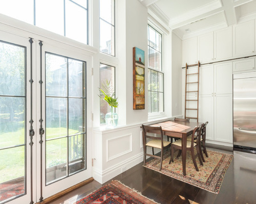
The former school building had great architecture to work with. The French doors and the windows flanking it on the right side belong to this unit. They open up to a courtyard garden.
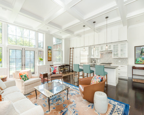
The project was a full gut job, including plumbing, removing asbestos tile from the original school, adding proper insulation and soundproofing the ceiling. The most important thing to note in this photo are the traces of the wall that came down to open up the kitchen to the living room (between the French doors and the window on the right).
“It was awful before,” Ziegelman says. “The rooms were chopped up into tiny spaces, and the kitchen had a low dropped ceiling.” The renovations included taking out the dropped ceiling and making it one high continuous ceiling over one big open space.
Her client came to her with lots of inspirations. “He wanted to be able to open the entry door and take in the whole place,” Ziegelman says. This is the view from the front door now.
They also came in with a lot of art, antiques and several smashing rugs. “The clients are avid art and antique collectors and owned almost all of the pieces in the space prior to construction,” interior designer Elana Rudiger says.
Kara Spelman, original photo on Houzz
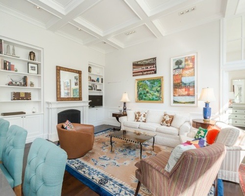
From this angle, the entry door is next to the bright painting and console table on the right. Rudiger layered in color to the white space via the clients’ own beautiful rugs and vibrant paintings. “The space needed to be very classic and we looked at a lot of images of Parisian apartments — white, clean, beautiful details, vintage mercury glass and marble mantels,” she says.
The clients also wanted to bring in coffered ceilings. “It was a challenge to figure out how the coffers would meet the kitchen cabinets on one side and the fireplace and built-ins on the other,” Ziegelman says. But after figuring out that puzzle, the ceiling is a success and helps to bring down the soaring 11-foot-10-inch-high ceilings to a more human scale.
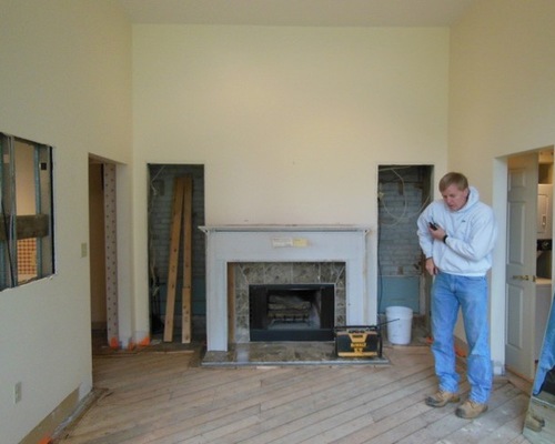
Before Photo, original photo on Houzz
BEFORE: Here’s a look at the living room before. The fireplace remained in the same spot. To the left, the architect had an awkward hallway to the laundry room removed.
Kara Spelman, original photo on Houzz
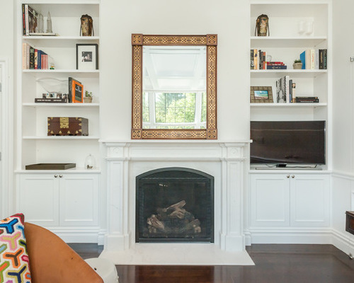
AFTER: “The moldings, panel details and dark muntins all reference classic architectural details,” Rudiger says. The Parisian apartment inspiration also influenced the fireplace area. Wainscoting, a formal fireplace with a marble mantel and surrounding built-ins were all part of the plans.
The mirror over the fireplace is scaled just right and bounces the natural light around. Its frame breaks up all the white with a warm touch.
The new floors are wide-plank walnut. Between the grounding of the dark floors and the use of light paint, all of the extensive millwork is pleasing rather than overwhelming.
The designers placed French doors with mercury glass panes throughout the home. “Using antiqued mercury glass helped open up the space and nods to the Parisian inspiration,” Rudiger says. The door to the left of the fireplace leads to the laundry room.
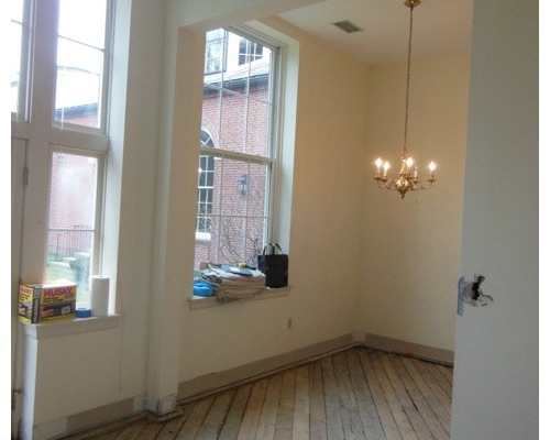
Before Photo, original photo on Houzz
BEFORE: The dining space was a small alcove off the kitchen.
Kara Spelman, original photo on Houzz
AFTER: Now it’s wide open to the living room and kitchen. The dining room area is defined by a rug. The table can be pulled out from the wall when there are extra guests; tucking it here creates an easier flow from one space to the next.
“As this is basically one big room, we used the rugs to define each area — entry, living and dining,” Rudiger says. “What I think this space does really well is show how many different styles of rugs, like art, can work seamlessly together; the space has a real collected, worldly feel.”
Ziegelman used every bit of vertical space, adding kitchen cabinets all the way to the ceiling, accessible via a library ladder.
The client and his family live a five-minute walk from the condo, and lots of visits from the three grandchildren were addressed in the design. There are three comfortable bar stools, as well as enough seats for the whole family in the living room.
Kara Spelman, original photo on Houzz
Modern Loft in a Converted 1920s Movie Theater
You’re going to have to really squint to see this next feature. “My client was enthralled by the invisible door in the Oval Office,” Ziegelman says. “We studied pictures of it to get it right.” Because the living room access to the bathroom was located in an awkward spot, they used a similar door here.
Did you spy it? It’s to the right of the TV. Adding the wainscot trim pieces in a way that was seamless, yet didn’t prevent the door from opening and closing, was another challenge.
Kara Spelman, original photo on Houzz
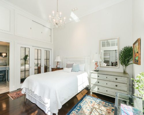
More mercury glass continues on the bathroom and bedroom closet doors. There is high storage above. A sweet chandelier brings the scale of the high ceiling down. A dresser doubles as a nightstand, saving precious space.
Kara Spelman, original photo on Houzz
The bathroom is accessible via the bedroom and the living room’s Oval Office invisible door.
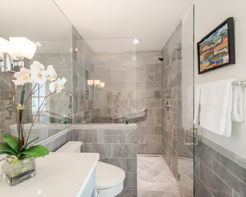
“We wanted the bathroom to feel hotel-like but have lots of storage,” Rudiger says. Because the room did not have a window, they used as much glass as possible to open up the space. This includes the large mirrored wall over the vanity and the glass shower door that extends all the way to the floor. Two medicine cabinets add extra storage.
The shower is curbless, a universal design feature. “The open plan and the width of all of the doors were also planned with aging-in-place in mind,” Ziegelman says. As for accessing the high storage, if she’s ever not able to do it, her son is just a five-minute walk away.