
With only a general mandate from the homeowners to restore the aging Boston brownstone and take it from dark and heavy to sophisticated and light, mother-daughter design duo Catherine Skaletsky and Dani McClure had carte blanche and their clients’ full trust to create something they would love. From its subtle color palette, custom finishes and functional layout, the homeowners feel that their trust was very well placed.
Brownstone 1: Eric Roth, original photo on Houzz
Photos by Eric Roth
House at a Glance
Who lives here: A professional couple
Location: Boston
Size: About 3,200 square feet (about 297.3 square meters)
Designers: Catherine Skaletsky and Dani McClure of Catherine & McClure Interiors
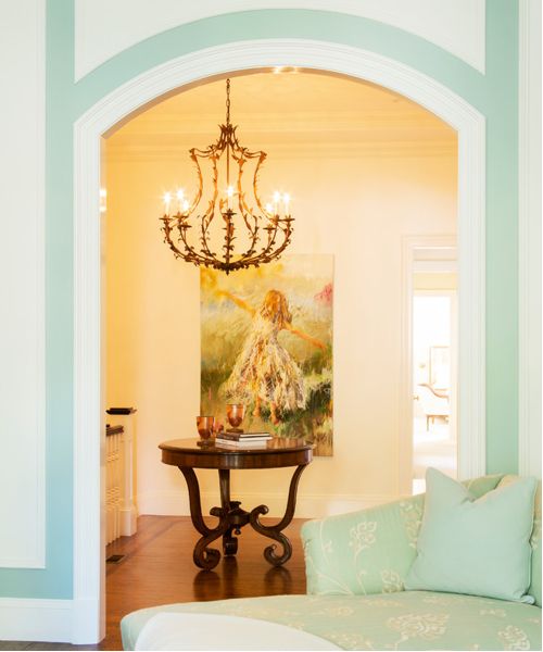
The townhouse is just a few blocks from Boston Common in a historic neighborhood prized for its architectural beauty. As you walk into the unit, you enter a formal entry with artwork by Susie Pryor, an artist based in Atlanta who created much of the art throughout the home.
Designers Catherine Skaletsky and Dani McClure say that many Boston homes tend to fill up on heavy, traditional art, and as beautiful and fitting as that can be in older townhouses, the designers wanted to brighten things up for these clients.

Brownstone 2: Eric Roth, original photo on Houzz
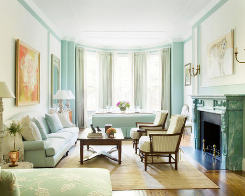
The fabrics came first in developing the color palette for the living room, which the homeowners adore for its perfect blend of lightness and sophistication. Next came paint. It was important to break up the walls and show off the room’s molding, so the designers chose a soft white for inside the trim, where they placed artwork, and used Benjamin Moore’s Palladian Blue to frame each section. “In person, the blue is even better,” say the designers, almost in unison. “The color is timeless; you’d never get tired of it, and it’s happy.”
The fireplace is original to the house but used to be painted yellow. The designers had their decorative painter employ a marbleizing technique to add vintage charm.
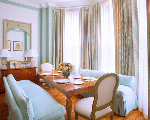
The clients’ one functional requirement was a comfortable spot to eat, since the home lacked a separate dining room. The designers wanted it to feel like it belonged in the living room, so they chose upholstered benches instead of the more expected dining chairs. The benches also make this dining nook a true multipurpose space: They can be turned around and used as extra sofas when the clients have a lot of guests.
Brownstone 3: Eric Roth, original photo on Houzz
Since the nook faces a busy street, it was also important to create a sense of privacy here. The draperies stay open most of the time, but when the sheers are closed, they let in sunlight in the warmer months and the gentle glow of twinkling lights that illuminate the street in the winter.
The designers employ this strategy often, layering draperies over operable sheers, even where there’s no privacy concern: “People love the decorative nature of draperies, but when you close them, they can look heavy,” Skaletsky says.
The house does not receive a ton of natural light, so the designers wanted to keep the decor and paint on the lighter side. For extra illumination, they installed some recessed lighting but primarily focused on creating a cozy space through ample lamp-lighting and sconces rather than overhead chandeliers and pendants. Bordering the fireplace are two antique sconces they had refurbished, and you’ll find assorted lamps from Formations and a stone pair from Dennis & Leen, two of Catherine & McClure’s go-to California vendors. The mirrors on either side of the sofa were an Atlanta antique find, one of many in the home.
Brownstone 4: Eric Roth, original photo on Houzz
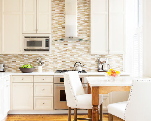
The galley kitchen was endowed with lovely original floors, but the rest of it needed a lot of cosmetic work. Kitchens weren’t always the “heart of the home” that they are today, and brownstones in this area tend to have smaller kitchens, according to the designers.
They stayed within the original footprint but modernized the look and function of the space: Like the rest of the house, the kitchen was pretty dark, so they painted the cabinetry a fresh white, added new white marble countertops and added white plantation shutters on the lower half of the window for privacy. The clients had requested a place to sit and eat in the kitchen, so the designers had a small table customized with a marble top to match the counters.
Explore More White Kitchen Designs
Brownstone 5: Eric Roth, original photo on Houzz
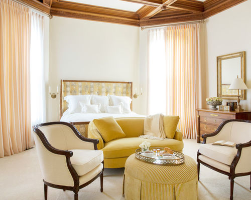
The brownstone used to be part of an embassy and the master bedroom a former library, with 15-foot ceilings and original beams. The designers were inspired by the room’s storied heritage and wanted to give it the grand feeling of a hotel presidential suite. “It already had that sophistication,” says McClure. “We just wanted it to be something really special.” They decided early on to keep it traditional but add some transitional elements, play off the ceiling and keep everything light.
The bedroom’s yellow color scheme started with the fabric on the headboard. The designers like to start with one or two fabrics and build a story out of it, giving the client several variations to choose from. The bed – custom along with all the other upholstered furniture in the room – is covered in a classic toile fabric on a walnut frame.
Invest in a Stylish New Bedroom Bench
Brownstone 6: Eric Roth, original photo on Houzz
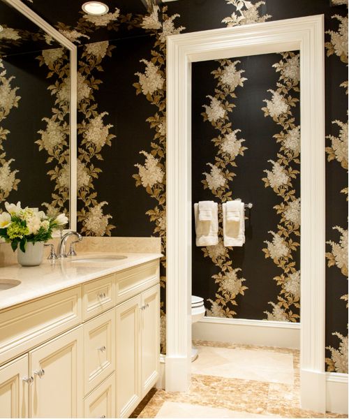
The guest bathroom features walls covered in Nina Campbell wallpaper. The designers wanted this place to feel dark and cozy, as a moody contrast to all the other lighter rooms throughout the home.