
Life was different when this traditional foursquare home near Boston was built in the early 1900s. Back then, rooms were separate and had clear assignments: The kitchen was for cooking, the dining room was for eating and so on. In those days, windows let in cold air during the winter, so they tended to be smaller and less embracing of a view.
This home had been remodeled over the years, and each refresh had added details that were not age- or architecturally appropriate and took the home away from the plain-spoken look of an American foursquare. The new owners wanted to bring back some of the original details (or what could have been original) and add modern touches, so they hired Robert S. MacNeille, design principal and president of Carpenter & MacNeille.
Before photo, original photo on Houzz
?
Houzz at a Glance
Who lives here: A couple
Location: A coastal community north of Boston
Size: 2,900 square feet (269.4 square meters) before, 5,000 square feet (464.5 square meters) after, including the new garage and game room
Architects: Carpenter & MacNeille
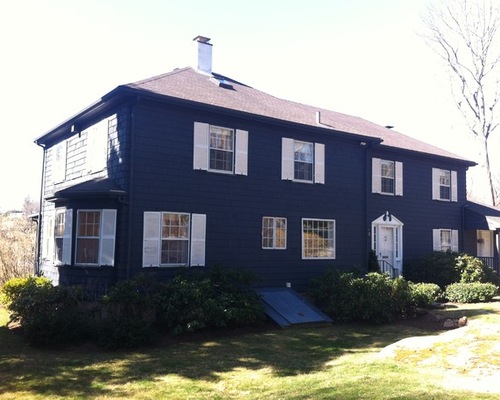
BEFORE: The home had been remodeled over the years, leaving it with dark siding and Colonial touches such as shutters and an elaborate pediment. “These things were not consistent with a foursquare house that had Craftsman touches,” says Wendy LeStage Hodgson of Carpenter & MacNeille. “At our firm, we are all familiar with the vernacular of coastal homes of this period. These homes weren’t fancy; they were simple. Everything we did here spoke to that. The things we added might not have originally been there, but they are right for the time.”
Related: Comfort and Ease in a Massachusetts Colonial
Carpenter & MacNeille, original photo on Houzz
?
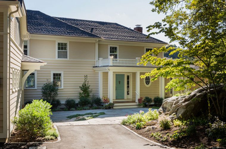
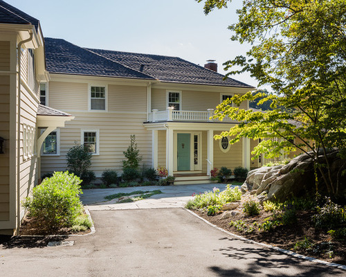
AFTER: The house is located on a beautiful cove north of Boston. The new house doesn’t look “new,” and the details make the difference. The siding is narrow on the upper story and wider on the lower level. A new porch makes it more comfortable to enter through the front door. It also provided the opportunity to add a classic balustrade — a railing supported by balusters — on top. The garage at left is a new addition. It allows for a game room above and a mudroom connecting it to the house. A new patio in front of the entry means you don’t have to walk through grass to get to the front door. “This remodel allowed us to clarify the home’s details,” says Anne T. Alberts of Carpenter & MacNeille.
House color: Shaker Beige, Benjamin Moore; house trim color: Soft Chamois, Benjamin Moore; door color: Dix Blue, Farrow & Ball
?
BEFORE PHOTO, ORIGINAL PHOTO ON HOUZZ
?
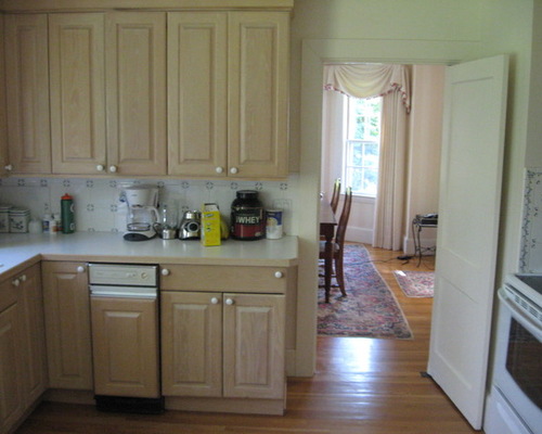
BEFORE: This shot shows the nature of the kitchen before the remodel. Through the doorway, you can see the former formal dining room.
Before the remodel, this home had a separate kitchen, dining room and family room. The rear wall was located close to where the photographer was standing to take this shot, in what would have been the family room. “There were just two small windows on that wall looking out to an amazing view,” Alberts says.
CARPENTER & MACNEILLE, ORIGINAL PHOTO ON HOUZZ
?
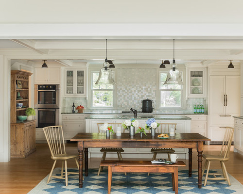
The architects made three big moves: They combined the kitchen and the dining room and added a window-lined conservatory at one end of the open space. Now a long row of windows captures the view. “The homeowner had a mantra that guided the entire project,” Hodgson says. “For her, it was ‘the view, the view, the view.’ ” To that end, the kitchen sink is positioned in the island so the homeowner can see the cove while cooking, prepping and cleaning up.
The homeowner also told the architects that she works on a laptop and prefers to work at the dining table. Placing this long table here allows her to work with water vistas to her side. This is a departure from the formal dining room the couple had before. “They found that they only used the formal dining room twice a year,” Alberts says. “Taking that information, we gave this more casual dining space.” The old dining room became the mudroom (more on that in a moment).
Kitchen cabinetry: custom, Stephen Terhune Woodworking; wall color: Soft Chamois, Benjamin Moore; trim color: Ashwood, Benjamin Moore; kitchen lighting: Factory Shade 3 in natural brass, School House Electric; faucet: Country Pull Out R77V3, Rohl; dining room lighting: Rustic Glass Pendants in large, Pottery Barn; table and chairs: Walker Creek Furniture; rugs: Landry & Arcari?
?The water views influenced the choice of colors and stone in the house. “The owner’s favorite colors are greens and teals,” Hodgson says. “At times, the water takes on these shades. We used them throughout the house.”
Counters: Polished Costa Smeralda Granite, Athena Marble & Granite; backsplash: custom blend of iridescent and matte glass tile, Discover Tile
Carpenter & MacNeille, original photo on Houzz
?
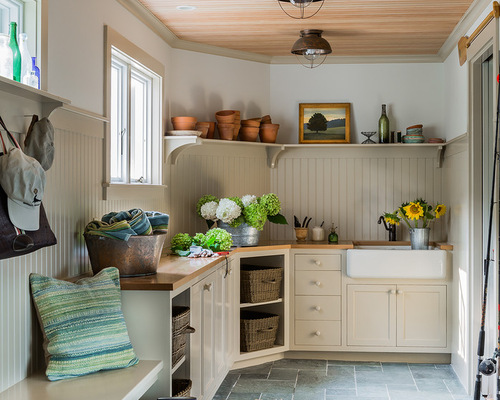
AFTER: A mudroom replaced the old dining room. (See the floor plans that follow for reference.) The mudroom bridges the house and the garage addition.
This family might not have had much use for a formal dining room, but the mudroom is a workhorse that’s used daily. One of the homeowners is an avid gardener, and this is her space for arranging flowers and changing out of muddy shoes and boots. A row of closets to the right, just out of frame, provides much-needed pantry and overstock storage.
Designers say that every home tells a story, and the tale of this mudroom is a bit of pleasant fiction. “We made the space look like it was a breezeway that had been walled in to create a vestibule or mudroom,” Alberts says.
Floor tile: slate in Marsh Green, Discover Tile; light fixtures: Grand River Lodge Fisherman’s Ceiling Light, Cabela’s; wall color: China White, Benjamin Moore; trim color: Shaker Beige, Benjamin Moore
The natural wood ceiling, the beadboard, the butcher block counters and the local slate (the kind that would have been used years ago) reinforce the room’s story.
Carpenter & MacNeille, original photo on Houzz
?
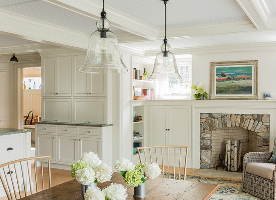
Another piece designed to look aged is the fireplace at one end of the dining room. “The client was very specific: She wanted the fireplace to look as if it was made from stone that was gathered from the property,” Hodgson says. “We explored doing just that, but we were unable to find right-sized stones.”
Instead, the design team found local rocks. Alberts says the clients enjoy the atmosphere of a fire near the dining table, and they often pull up two chairs to relax by the flames before and after dinner.
Related: Freshen Up Your Living Room With a New Area Rug
Carpenter & MacNeille, original photo on Houzz
?
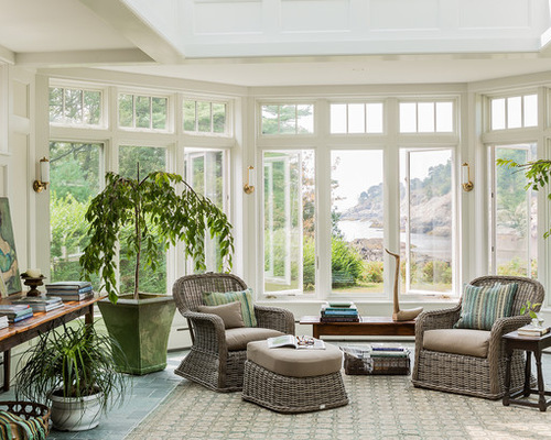
Now for the star of the show: the view. Looking at the water outside, you can see why the clients chose it as the driving feature of the house.
The new conservatory acts as a modern-day family room, but its design also has roots in the past. “Conservatories show up in old homes up and down the coast,” says Hodgson. “They would have been located off mudrooms, and they were a place where you’d bring in your plants to overwinter them. Back then, it was more of a utilitarian room, not a place where you’d go out and sit.”
Floor tile: slate in Marsh Green, Discover Tile; lighting: Merchant Single Wall Light, Visual Comfort
That said, this room is filled with plants and outfitted with a stone floor — a feature that would have been desirable for turn-of-the-century gardeners who were watering plants indoors during the winter.
Floor plan, original photo on Houzz
?
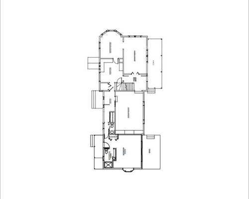
BEFORE: To understand the project, it’s helpful to look at the before and after plans. Here, you can see the home as it was prior to the remodel. The kitchen, dining room and family room are distinct rooms, and there’s not much of a connection to the view.
Floor plan, original photo on Houzz
?
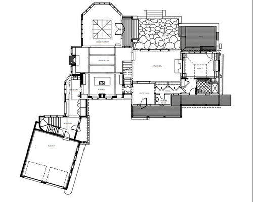
AFTER: Now take a look. Among other changes, you can see how the kitchen, dining room, mudroom and conservatory relate to one another.
In the end, it was as much about subtraction as anything. “We stripped away all of the extra details that didn’t fit,” Alberts says. Hodgson adds that the insertions were as important. “We jazzed up a simple house with great, period-appropriate architectural details,” she says.
Like a writer, many old houses can be made better with a little editing.