
Sometimes when people talk about working with paint colors, they make it seem like there are two camps: those who love color and those who eschew all strong hues in favor of endless shades of gray. In reality, there are many hues that skirt the line between rich color and humble gray, and these “off-gray” hues have become especially popular lately (with several paint companies even naming very gray shades as their 2017 Colors of the Year).
If you’ve been craving a little more color in your palette or wanting to find a more mature treatment for your neon walls, I’ve got 10 beautiful off-gray hues for you to consider.
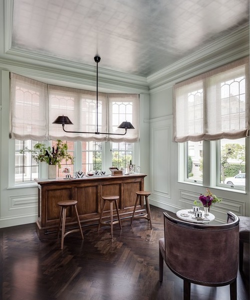
Off Gray 1: Eoin Lyons, original photo on Houzz
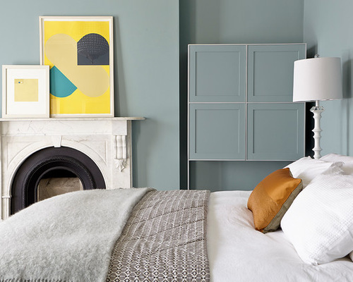
1. Deep-sea dreams. Don’t have the luxury of falling asleep to the sound of oceans waves? How about the color instead? The grayed-out blue-green of this dreamy bedroom feels fresh and serene contrasted against white bedding and pops of hot hues, without being so dramatic as to keep you up at night.
The fact that blue and green are such easy hues to work with helps keep this shade almost as neutral as a strictly hue-free gray, making it an excellent choice for the truly color-shy who only want to dip their toe in.
Try: Sea Star by Benjamin Moore or Gray Wool by Behr
Off Gray 2: Robert Rhodes Architecture + Interiors, original photo on Houzz
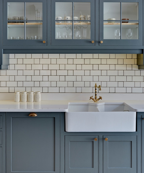
2. Not quite navy. Navy is a classic neutral, but sometimes you don’t want a shade that’s quite so deep. A gray-blue is the perfect solution to keep a sense of timeless nautical tradition but in a color that won’t plunge your whole design into murky darkness.
Cabinet paint: Farrow & Ball Down Pipe. For something similar, try Freedom Found by Olympic or Needlepoint Navy by Sherwin-Williams
Off Gray 3: Crown Point Cabinetry, original photo on Houzz
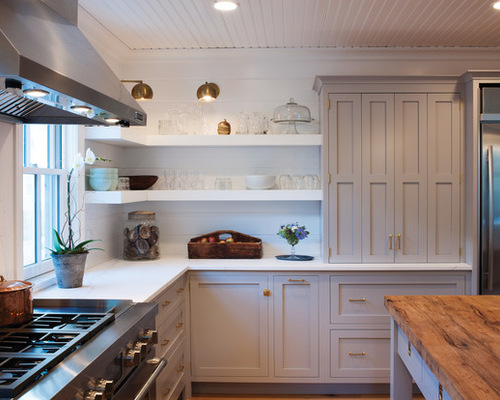
3. Shy blush. Pink as a neutral? It’s a ludicrous idea to some, but even ardent skeptics may be won over by the subtle charm of this secretive blush-pink-gray. In fact, Farrow & Ball named such a hue its 2017 Color of the Year, so you’re not alone if you find yourself falling in love.
Like many of the hues here, this one looks spectacular paired with crisp white; it’s also a perfect complement to brassy accents like drawer pulls and sconces.
Cabinet paint: Farrow & Ball’s Dove Tale. For a similar look, try Peignoir by Farrow & Ball or Truly Taupe by Glidden
4. Autumn bliss. Green with gray doesn’t sound like the friendliest combination, yet everywhere from a poised office to an imaginative playroom it feels perfectly natural. This is probably because it combines such earthy colors to produce an organically beautiful shade.
Green-gray shades like this one suit a historic home, but they also look completely modern when paired with stark black and white for a little punch.
Try: Bay Sands by Valspar or Saybrook Sage by Benjamin Moore
Off Gray 4: Town Line Wallpaper & Paint Inc., original photo on Houzz
5. Hint of mint. This minty gray is a bit more light and bright than the previous color, and the results are even more lush and “springy,” yet still very easy to work with. It goes as well with the warm woods as it does with the silvery ceiling, proving its ability to extend an olive branch to all sorts of differing colors. Use it for a dining room to offset a wooden table and gleaming cutlery or to wake up your office without being distracting.
Try: Silent Breath by Dunn-Edwards or Borrowed Light by Farrow & Ball
6. Very off-white. Do you see this color as a slightly creamy gray or as a slightly gray cream? It’s a bit of a glass-half-full-glass-half-empty situation, but either way it’s a sleek and sophisticated shade for an entryway or other busy space, and it’s smart too: This subtle gray-beige stands up to dirt and makes surrounding whites look even whiter.
Try: Athena by Benjamin Moore or Pearly White by Sherwin-Williams
7. Barely blueberry. A blue-gray with a hint of purple feels girly, but in a grown-up way. It’s perfect for a casual but composed living room with a breezy atmosphere and a rotating palette of accent colors, especially pastel shades.
Try: Sparkling Frost by Dunn-Edwards or Icy Waterfall by Glidden
8. Vintage grape. What could be better in an entertaining-ready dining room than a sumptuous wine-inspired shade? A toned-down purple takes the drama and glamour inherent to indigo hues and blends them with the gravitas of gray to achieve a livable — but lively — shade that’s sure to stimulate some conversation.
Try: Coal Mine by Behr or Shadow by Benjamin Moore
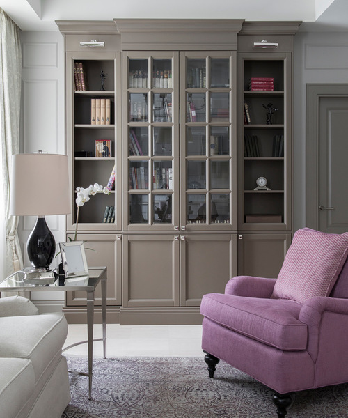
Off Gray 5: Dean Alexandrov, original photo on Houzz
9. Chocolate greige. The design world, just like your diet, always returns to chocolate every now and then. This contemporary take on brown mixes it with a heavy dose of gray to achieve a color that’s less sugary and more mysterious, with very adult results. Pair it with silvery metallics to bring some crispness or with hot, vibrant hues to embrace the warm undertones.
Try: Castle Wall Grey by Glidden or Gallery Grey by Valspar
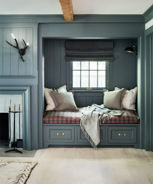
Off Gray 6: Traditional Family Room, original photo on Houzz
10. Cozy cabin. Our last color may seem a lot like the first, but it’s actually a whole different animal. This darker, greener and more silvery shade of blue-green is great for a contemporary cabin in the woods or a big-city home that aims to bring in some farmhouse charm. It’s not shy, but it can make a big space seem more intimate or a smaller space feel absolutely cozy.
Try: Coney Island by Behr or Inchyra Blue by Farrow & Ball