This year, Pantone’s Color of the Year, Classic Blue, is gracing everything from wallpaper and stationery to end tables. Here, three prominent local designers and architects weigh in on the deep, elegant hue and offer expert tips on how to use it at home.
Chris Brown, AIA, LEED AP
Principal, b Architecture Studio Inc.
How do you approach the new Pantone color each year?
“It’s a way to explore why people are drawn to that color and then see if we have clients that may feel the same way. We are constantly looking for great classic colors that make the space complete or add a spark of interest.”
What do you love most about this year’s hue: Classic Blue?
“I think the classic blue gets personal, and the more you ask people you may find that blue is a favorite color. I’m one of those people. My new car is blue and a lot of my clothes are, too. I still remember walking the streets of Rome and seeing this classic color in shirts and it still sticks with me—just ask my wife.”
Your top design tips on how to use the color?
“Treat it like any other part of your design and process, intake what the clients gravitate toward, show examples and studies, coordinate with the other materials in the room, have the paint be a healthy/green product and have some fun.”
“Have mock-ups of color painted on large but movable panels so that you can move the color around in the space and/or home. This allows you to see how both natural and artificial light affects the hues and the color. What may be perfect in a northern exposure room may not even be recognizable in another part of the home.”
David Boronkay
Principal of Slocum Hall Design Group, Inc.
How do you approach the new Pantone color each year?
“Typically, our team does not pay much attention to Pantone’s annual color selection in our designs. The past two years, the colors have not really spoken to our design aesthetic. Our interiors tend to be more subdued and allow the architecture to be the prominent feature. Many of our clients are drawn to more neutral palettes, with pops of color in art or furnishings. That being said, we are loving this year’s selection.”
What do you love most about this year’s hue: Classic Blue?
“Coincidentally, our new office uses a shade of blue very similar to Classic Blue in our entry lobby: Benjamin Moore’s Blue Danube. We have used Farrow & Ball’s Drawing Room Blue on several projects, which is also quite similar to Classic Blue.”
Your top design tips on how to use the color?
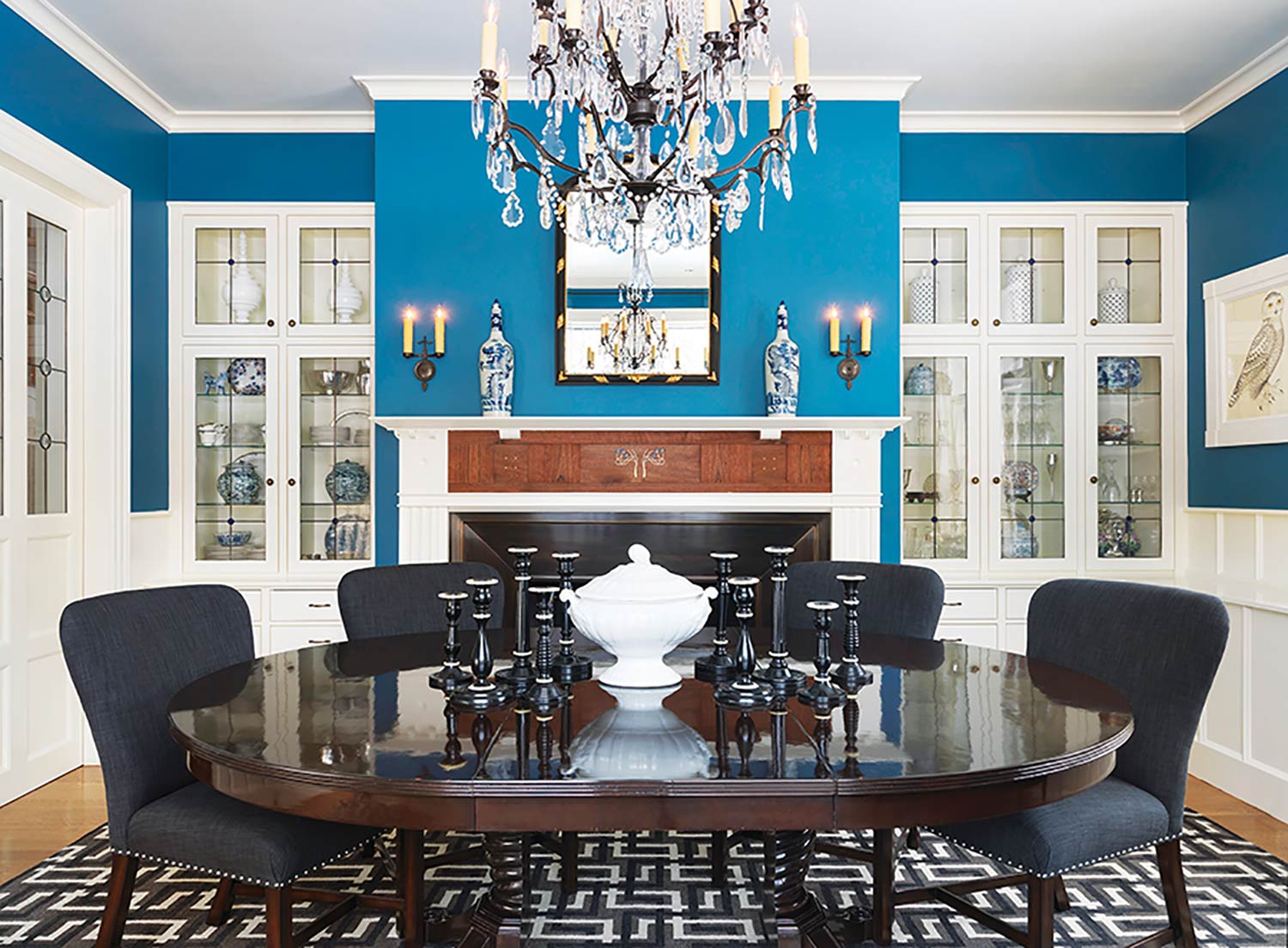
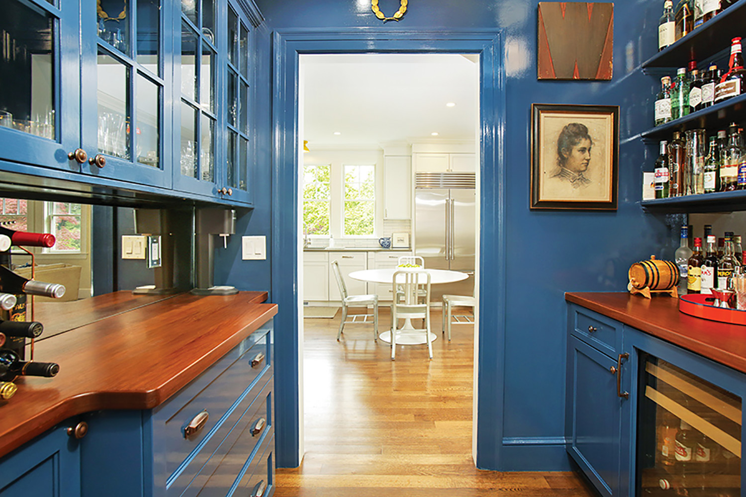
“Paint it all. In a smaller space like a butler’s pantry, a study or a powder room, we love to paint the entire space uniformly including the walls, built-in furniture, and ceilings. Often, we use a satin or a gloss finish to make the space feel like a jewel box. When working with color with a sheen, you need to make sure the plaster is perfect and you work with a skilled painter.”
“Accent walls are passé. Painting a singular wall a contrasting color feels contrived and dated. Introduce colors with your furniture selections or with bold artwork.”
Michael Ferzoco
Principal, Eleven Interiors
How do you approach the new Pantone color each year?
“Cautiously. We pride ourselves on not following trends to such an obvious level; however, we take into consideration the recent ‘fashion’ of the interior design industry and incorporate it into our projects on various levels (sometimes just a hint of the color, and other times an entire custom kitchen in the color), depending of course, on the project and the client.”
What do you love most about this year’s hue: Classic Blue?
“This year’s color is for us, a ‘colorful neutral’ because it works with every other color in a wide range of hues of every other color. You simply can’t go wrong with Classic Blue. Hence the name, of course.”
Your top design tips on how to use the color?
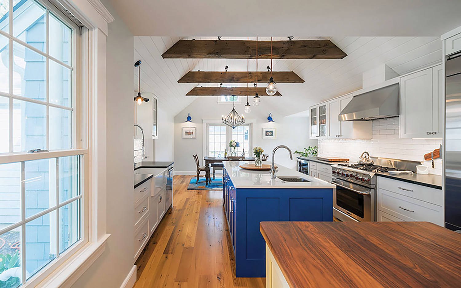
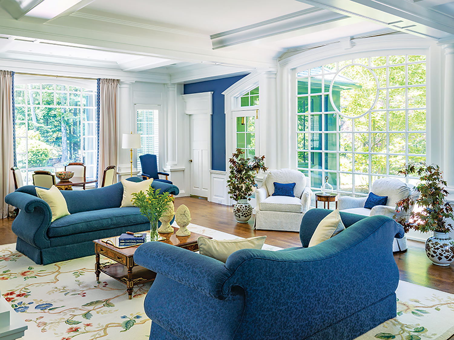
“Go all in, or use it in small doses. For the former, we would do custom kitchen cabinetry or large sofas and painted walls [as pictured]. And for the latter, we would use the color in a bathroom accent tile, a kitchen backsplash, living room accessories, or perhaps a light fixture.”
barchstudio.com | slocumhalldesign.com | eleveninteriors.com | shconstruction.com