

California may be the popular face of American midcentury modernism, but New England developed an important modernist movement of its own, fueled in part by the Harvard Graduate School of Design. Walter Gropius arrived at Harvard in the 1930s after founding the Bauhaus in Germany, bringing European modernist ideas to a generation of American architects. Among those who came through Harvard was Martin Bloom (1927–2017), a Massachusetts-born architect and urban designer who grew up in Malden. He studied during an especially influential period for American modernism and later cited Gropius and Josep Lluís Sert among his influences.
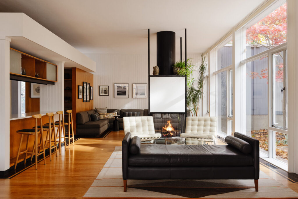
After graduation, Bloom designed a home commissioned by his sister, Phyllis Patkin, and her husband, Stanley. He pulled out all the stops, infusing the structure with trademark midcentury modern details: flat roof, open floor plan, statement fireplace, functional built-ins, and expanses of glass. Phyllis lived in the house for nearly 60 years, remaining there after her husband died. In 2019, the home welcomed new stewards: Dana and Joseph Arndt and their son, Dylan. “For us, finding this home was a revelation. It was a total surprise to end up owning a truly modern home on the North Shore. It felt like falling through the rabbit hole in Alice in Wonderland,” describes Dana. Thanks to Phyllis, she adds, the house was remarkably intact, almost museum-like.
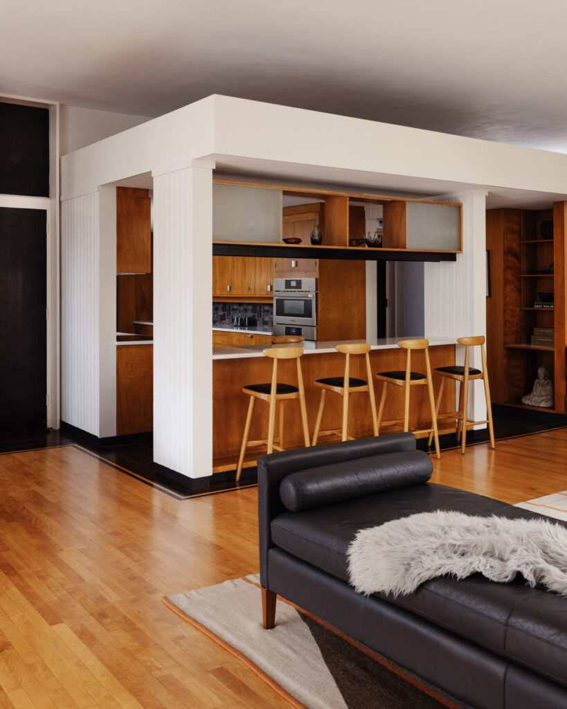
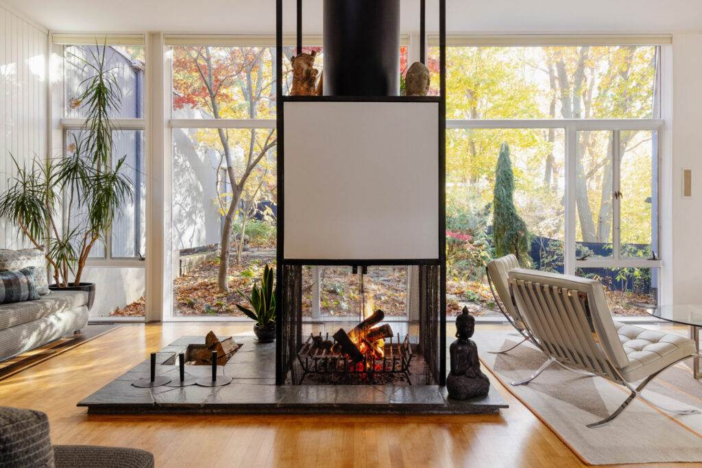
After tackling considerable work outside, the Arndts turned their attention to the interiors, work – ing with designer Isabel Stover, principal of Design Vision, and general contractor Cain Newman of Kitchenworks. With a master’s degree in architec – ture, Stover was well-suited for appreciating midcentury modern while layering in the family’s aesthetic and functional needs. Notes Dana of working with Stover: “We wanted someone who truly appreciated the home—we think of ourselves as keepers of its story. Isabel got it right away; you could feel her passion.”

This shared appreciation steered the renovation. “We discussed a lot of different options materialwise, but ultimately, we kept coming back to being as minimal with change as possible. Our goal was to enhance what was already there and make updates blend,” explains the interior designer. From the get-go, it was clear the team would not alter or remove any of the home’s custom built-ins. For Stover, they represented a puzzle, especially their yellow/orange stain, which represented a fourth tone to consider along with an existing palette of black, white, and grey. In the galley kitchen, new appliances, counters, and flooring joined the original cabinetry (also yellow/orange) and hardware. Replacing an old sliding window with larger versions brought in more natural light and strengthened the visual connection to the landscape.

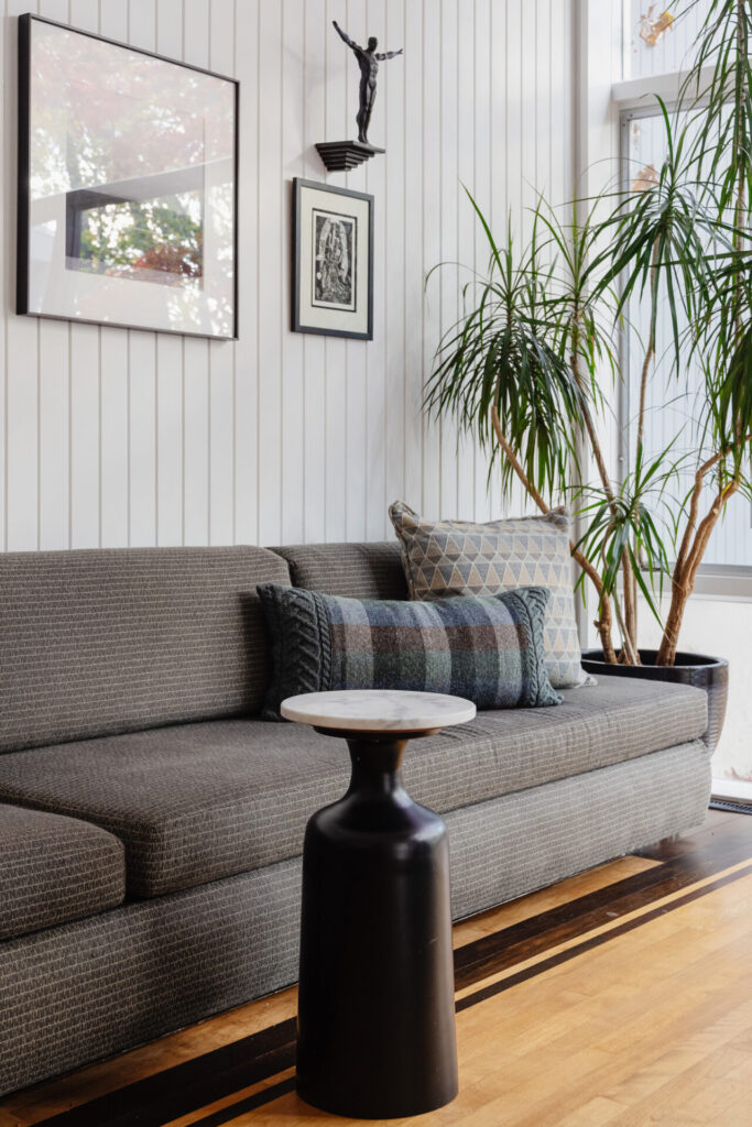
The home’s living, dining, and kitchen spaces flow around a four-sided floating fireplace, the architectural and emotional heart of the home. Within the glass-filled living area, the fireplace’s solid geometry creates a cozy anchor and gives the expansive space a sense of intimacy. On one side of this feature, an original built-in sectional was reupholstered in steel-gray fabric. On the other, two Barcelona chairs partner with a double-sided chaise from the owners’ collection. Low profiles preserve sight lines to the curated gardens. In the adjoining dining area, a substantial live-edge, wood-slab table that Dana and Joseph finished themselves offers an organic counterpoint. “It bal – ances out the strong geometry and angular nature of the house with a more organic form,” points out Dana.

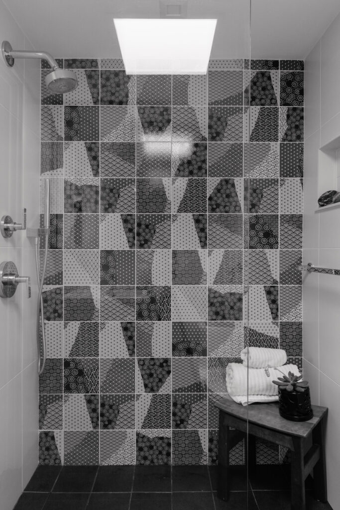
“It also connects to the organic forms outside.” In the bedroom wing, raised up a half level from the main living spaces, two back-to-back bathrooms needed more substantial attention. “They were sterile—a bit hospital-like,” recalls Stover. Yet their straightforward function was true to the era. “They were never meant to be huge oases,” Dana adds. “They were supposed to be simple, efficient spaces.” In the primary bath, a little-used tub gave way to a curbless walk-in shower. Both bathrooms feature tile by Fioranese, sourced through Division 9 Collabora – tive in Boston. Its Kintsugi pattern takes its name from the Japanese art of repairing broken pottery, turning fracture lines into part of an object’s beauty.

While respect for the architecture remained paramount, Dana also encouraged Stover to push her beyond her comfort zone. Pattern offered an opportunity. In the kitchen, a fire-rated vinyl wallcovering takes the place of a conventional backsplash. “I didn’t want tile—it just feels too typical to me,” Dana explains. “The one we went with is definitely out-ofthe-box, but I love the graphic design and how it connects to all the other black accents.” The powder room goes even bolder with Osborne & Little’s Kutani wallpaper. Inspired by Japanese art, stylized flowering branches, blossoms, and foliage sweep across a contrasting ground, emulating the feel of a hand-painted screen.

These Japanese references feel appropriate for a house so closely attuned to its surroundings. From nearly every angle, the architecture establishes a kinship with nature. Daylight, views, fresh air, and the changing landscape become part of daily life. “It’s an amazing thing to have such a direct connection to the landscape around you on a daily basis,” expresses Dana. “As soon as you step inside, you feel like you are outside again. We pay more attention to the seasons, the weather, and the small details going on all around us. “So many people change a house to make it their home,” Dana continues. “But this house—it changed us.”