
“There was no bidding war, but there was a lot of work,” says Carolyn Salinetti, about the 2,000-square-foot fixer upper she and her husband purchased in Melrose nearly ten years ago. Nice light, a decent layout, and sweet architectural details attracted the designer, who owns Blissful Interiors, to the 1940s Cape Codder.
It was certainly not the chipped kitchen cabinets and red Formica countertops that reeled them in. They swiftly swapped those out and did some other things to make the house livable. As they checked other easy fixes off the list, the couple learned that termites had rendered the back of the house structurally unsound. “We saved for an addition and hoped the house wouldn’t fall down in the meantime,” she says.
Fast-forward five years, and Salinetti worked with architect Emily Lammert to design a two-story addition with a 250-square-foot footprint. A primary suite with a deep window seat and a walk-in closet that is the envy of the neighborhood tops the family’s new kitchen, which while clearly not a relic of the forties, feels fitting for the home. “I didn’t want a glistening, white kitchen,” Salinetti says. “It needed a cozy vibe that matched the rest of the house.”
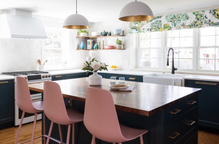
The kitchen is at the rear off the dining room, where an extra-wide cased opening connects the two spaces. Cabinetry wraps the other three walls, creating a highly functional U-shaped layout with a center island, a must for a family of five. The old kitchen became a mudroom, another must-have, and allowed for a walk-in pantry too.
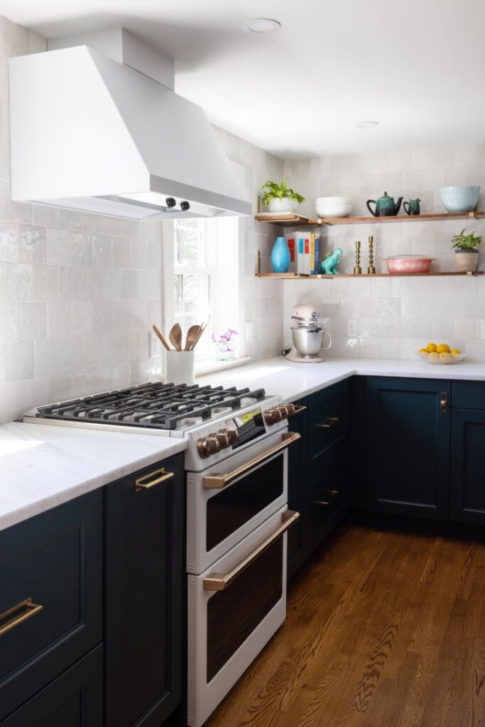
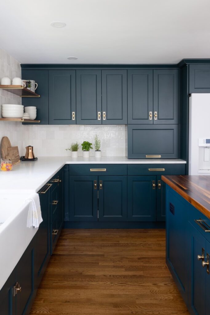
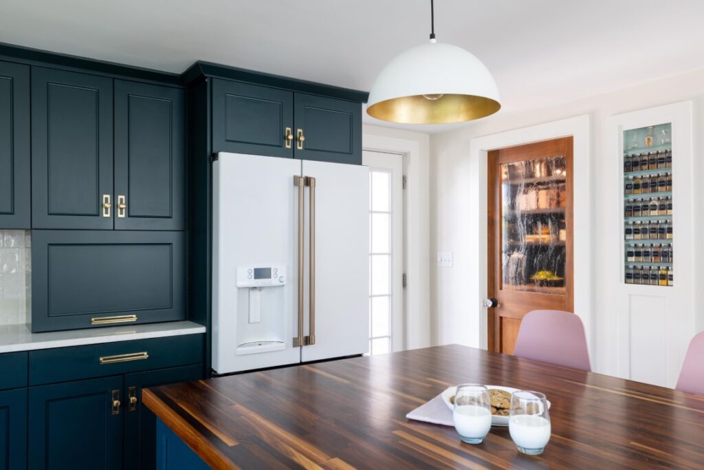
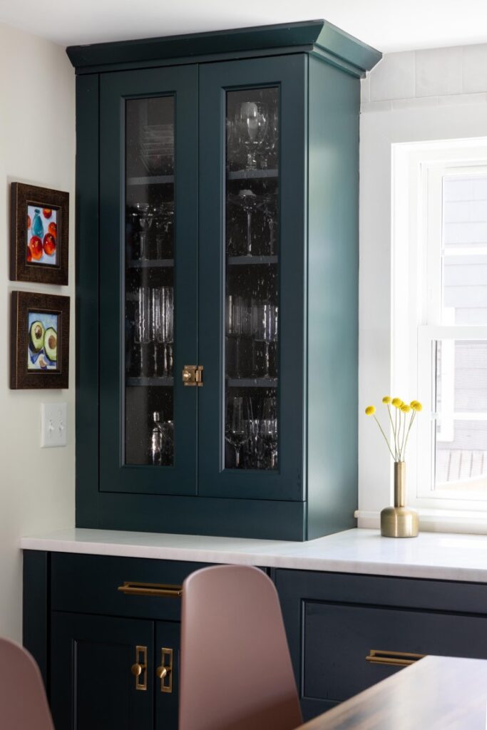
Color was key for cultivating homeyness and cheer. Salinetti chose a rich teal hue for the transitional-style cabinetry, a color she describes as neither green nor blue. “It reads differently depending on the light,” she says. She was particularly enamored with how it complements the brass trim of the GE Café appliances she had her eye on and ultimately selected. The hardware—a simple, not-too-sleek knob paired with crisp backplates—boasts a brass finish too.
While the original kitchen was short on windows, this one has a trio of windows, over the farmhouse sink, that face the backyard and windows flanking the range that overlook the side yard, all with sills that come down to the honed Pegasus marble countertops. “I’m all about the feel of things,” Salinetti says. “Honed marble is one of my favorite materials to touch.” As for maintenance, she doesn’t mind. Besides, most of the prep happens at the butcher block-topped island.
Glossy ceramic tiles with an uneven texture in various shades of white run to the ceiling, imbuing subtle interest and warmth. Walnut shelves enhance the effect and display items that Salinetti holds near and dear, such as a dinosaur planter that her son gave her as a birthday present. “All our personalities are wrapped up in here,” the mom of three says.
The Schumacher “Citrus Garden” Roman shade, a colorful and cheerful yet sophisticated (not to mention iconic) pattern encouraged Salinetti to pull various colors into the scheme. “The shade gave me permission to surround the island with pink counter stools,” Salinetti says with delight.
The island itself is topped with walnut butcherblock, a material Salinetti had her heart set on from the start. “It brings in so much warmth and ties into that older feeling I was going for,” she says. White dome pendants with metallic gold interiors echo the appliance palette, cast golden light at night, and offer an unexpected view to someone who looks up.
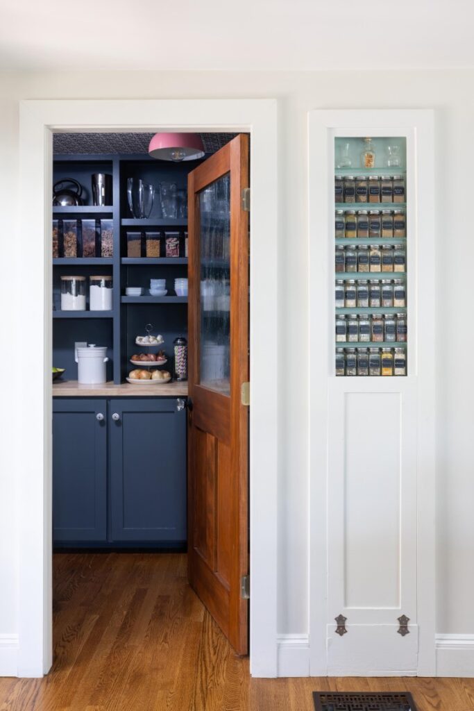
Behind the island is a walk-in pantry with a custom walnut door complete with wavy, seeded glass. Not one to waste a design opportunity, Salinetti quickly decided this would be a decorative pantry, not one with cereal boxes shoved in willy-nilly. Due to the shallow depth, she went custom for the shelves, which are painted in Benjamin Moore Ocean Floor, a blue-gray with a charcoal cast. A light wood butcherblock countertop breaks up the dark color, while painted ceramic knobs, wallpaper on the ceiling, and a pink flush-mount light fixture amp up the style. “The combination of these elements feels historic,” Salinetti observes.
Perhaps the kitchen’s most charming feature, however, is the spice cabinet fashioned from the home’s original ironing board closet, now painted robin’s egg blue. Easy-to-clean glass shelves offer easy access to the alphabetized bottles, each with a retro handwritten label. “We carefully removed the top piece before demo, then reinstalled it,” Salinetti says. “We also retained the hinges; I boiled 80-years of paint off them.” Features like this made the fixer upper well worth the effort.
Learn more about the project team
Architect: ART ARchitects
Contractor: Hunter Whitmore, Whitmore Brothers Construction Co.
Landscape architect: Nina Brown, Brown, Richardson + Rowe