

As soon as Karen Swanson walked into the kitchen of her clients’ home, she knew exactly what it needed—natural light—and how to get it. The kitchen, located between the formal dining room and family room, was too small and much too dark, given there was just a single, underwhelming window over the sink. “If the wall to the dining room came down, I imagined how much light could spill in,” Swanson, who is the founder of the kitchen and bath design firm New England Design Works, says.
Light-Filled Expansion
The clients, a young family of four with a dog, were immediately on board. That said, the fix wasn’t quite so straightforward. Swanson further tweaked the floor plan to enlarge the kitchen. The Colonial-style home devoted a disproportionate amount of square footage to the first-floor living spaces, neglecting the kitchen. With some shuffling, Swanson expanded the kitchen by absorbing the dining room, which more than doubled the kitchen’s size and bestowed opportunity for plentiful windows.


The kitchen also absorbed a bit of the den that sat just beyond the original dining room. The move created some dimensionality; instead of the kitchen being a basic rectangle, the room now turns a corner. The move allowed Swanson to extend the counter at the right of the range as well as create a drinks area that wraps that corner opposite. The remainder of the den became the new dining room. That space is a near-square now, nicely accommodating the family’s existing round dining table. “The proportions of the kitchen and the dining room feel better now,” the designer says.
Reconfiguring the original dining room’s unfashionable bay window was also impactful. That stretch of wall now boasts a nearly 10-footlong bump-out featuring a bank of three windows that come down to the countertop, the kitchen sink centered on the one in the middle. “The angles of a bay window are very limiting in a kitchen setup,” Swanson says. “Squaring it off makes the space feel expansive and lets sunlight pour in.”
In terms of aesthetics, the starting point was the black Lacanche range with brass accents, a must have for the couple. From there, Swanson, the homeowner, and interior designer Meghan Shadrick, who collaborated with Swanson and worked with the couple on the spaces surrounding the kitchen, visited a stone yard to choose a material for the counters. Swanson’s first inclination—Imperial Danby marble—was a win. “I love how the warm, rust brown tones play off the range,” she says. A beautifully veined slab installed behind the range enhances the effect.
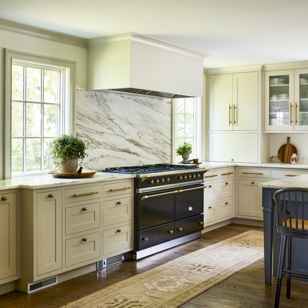
Stone Inspiration
Shadrick took cues from the stone and the couple’s traditionalist leanings in choosing the paint colors—Farrow & Ball Shadow White, a pale taupe, for the cabinetry and moldings and Benjamin Moore Cloud White, a gentle cream, for the walls. Although the team added more windows—new, generously sized windows flank the stove—Shadrick shied away from bright white. “This rich, warm pairing sings in the space.”
The stone also dictated the size of the island, done in Farrow & Ball Downpipe, a dark gray with blue undertones that anchors the space. “We made the island as large as possible without requiring a seam in the stone,” Swanson explains. “Some marble slabs, especially Italian ones, can run small, but Vermont Danby slabs tend to be larger as well as more durable.” And, the honed finish aids against etching. Swanson hung an Urban Electric Co. linear pendant with custom shades above the island. “The mottled, tea-stained fabric and leather trim play off the marble veining,” she says.
Behind the island where the beverage center turns the corner, the new dining room is visible through an elegant arch. “When you walk through a typical cased opening, it feels like you’re leaving one room and entering another,” Swanson explains. “The arch is more welcoming, showcases the dining room, and makes it feel more like part of the kitchen.” It also softens the angularity of the jutting corner.
Monochromatic Mural
Inspired by the homeowner’s love of plants, Shadrick wrapped the dining room in a custom, monochromatic mural by Susan Harter Muralpapers. The scene, a rural landscape in the Cotswolds, gives the small space presence without overwhelming it with color and pattern. “She loves leafy greenery and the outdoors,” Shadrick says. “This helps the eye travel around the space and brings nature in.” The perfect final touch and fitting complement to all the new windows.