Subscribe Now


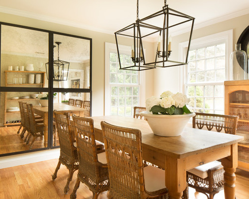
Interior designer Kelly McGuill loves light and bright spaces, mirrors, the patina of antiques and the contrast between dark and light. She and her husband built their Colonial-style home 22 years ago, and while some special pieces are always with them, they’re always open to change — for example, they completely renovated their kitchen this year. The overall look that ties things together is a simplicity that makes the home easy and comfortable. “I’d call it modern country,” the designer says.

My Houzz: Goodwill and Good Taste in a Grand Colonial


Tamara Flanagan, original photo on Houzz


Houzz at a Glance

Who lives here: Interior designer Kelly McGuill, her husband and their two sons

Location: Walpole, Massachusetts

Size: Five bedrooms, four bathrooms

Designer: Kelly McGuill of Kelly McGuill Home


After 22 years in their home, designer Kelly McGuill and her husband decided it was time for an extensive kitchen update. “We love natural light and bright spaces, and the upper cabinets in our old kitchen weighed it down and made it dark,” she says.

In preparing for the renovation, McGuill did a merciless cleanout; after editing things down to what they really use, she found she now has a lot of extra cabinet space. In addition, today’s lower cabinets are much more efficient. For example, the designer is a big fan of space-saving drawers for pots and pans.

“I love the contrast between clean and modern and the patina of antiques,” McGuill says. Crisp cabinets and walls, streamlined drawer pulls and a stainless steel range are the modern part of the mix, while a well-curated selection of antiques adds interesting patinas such as well-worn wood and antiqued mirror.

Gorgeous honed Carrara marble countertops and a coordinating backsplash bridge the two styles. “It has the old-world style you see in Italian bakeries,” McGuill says. “I use a sealant that makes it more durable than polished marble, but you have to embrace the wear and tear that will happen.” She extended the backsplash 12 inches to bring the gray veining up the walls and continue the streamlined look.

Because the whole family enjoys the views of the backyard, McGuill decided to forgo using pendant lights at the island. This keeps things clear.

One of the large items bringing in the contrasting patina of wood is this antique shoe-drying rack that McGuill found at the Brimfield antique fair, a favorite source. Fortuitously, the racks are also just right for storing wine bottles.


Tamara Flanagan, original photo on Houzz


“We are huge entertainers and everyone always wound up in the kitchen, even when it was small,” McGuill says. So during the renovation she decided to open it up to a former playroom that her sons had outgrown. It gives the family plenty of room for eat-in space at an antique farm table and more cabinet and appliance space.

“This table just gets better with age,” McGuill says. “There is nothing you can do to it that will ruin it.” The beautiful glass chandelier from Ochre was a splurge the designer had dreamed about for years. The glass is a beautiful contrast to the beautifully beat-up patina of the table.

In addition to a beverage refrigerator, there’s an extra oven back here. “That was something my husband really wanted, and it’s great for when we have big gatherings,” McGuill says. “Because we don’t need it that often, it didn’t need to be in the work triangle in the middle of the kitchen.”

The screened-in porch opening was widened during the renovation. To the right is an antique dish rack, bringing in more aged wood. The glasses up top belonged to McGuill’s grandmother; those on the bottom are test tube bottles.

“I also like to hang art from the rack,” she says. To the right, an antiqued mirror adds patina. “I love mirrors; in my opinion you can never have too many mirrors.”


Isaac Wood, original photo on Houzz


“I am a big believer that a screened-in porch is an extension of the interior and should have furniture that is just as comfortable,” McGuill says. Of course, it also has to stand up to the elements. She outfitted the space with reproductions of antique wicker sofas, indoor-outdoor fabrics from Perennials and a custom ottoman in faux leather. A durable hide adds a layer of texture to the floor.

Note the triangle window — you’ll see that detail repeated in another room.


Kyle Caldwell Photography, original photo on Houzz


In the family room, a great antique find creates a focal point over the sofa. It’s an old lithograph of the day the fountain opened on Boston Common in the 1800s, and it used to hang in the Boston Public Library. “This is a really special piece and it adds the huge contrast of black and sepia against the white wall.… I also added great lighting for it,” McGuill says. The damage on the bottom just adds to its appeal.

The designer went for durability with a leather sofa and chair and a jute rug. “With two sons and their friends coming over, you really can’t go wrong with leather,” McGuill says. Reclaimed wood and metal add to the texture palette. A Bertoia wire chair mixes in a dash of midcentury modern style.

“I like to have lighting from different sources at different heights,” McGuill says. The white table lamp is an antique, while the ceiling light is a modern take on a lantern. Floor lamps bring in good reading light.


Kyle Caldwell Photography, original photo on Houzz


The designer made several clever moves to make the modest-sized dining room seem larger. First, she used a pair of modern open lanterns that don’t block too much of the view. Next she added four mirrors on the wall. Finally, she chose wicker chairs that have a see-through look.

The farm table was one of the first purchases she and her husband made as a couple 28 years ago and it’s a real favorite of theirs. The chairs are antique reproductions and the cabinet was inherited from a beloved aunt.


Kyle Caldwell Photography, original photo on Houzz


Upstairs, the couple knew they’d want a lot of light in their bedroom and came up with this special triangle window behind McGuill’s desk.

The black and white contrast continues up here with the No. 4 poster. They chose it because there are four of them in the family. The desk is zinc and is an antique; the chair is vintage midcentury modern. A fiddlehead fig, a large basket and an antique Oushak runner round out the texture palette.

The wall lamp can provide bedside light or swing all the way over to the desk.

McGuill gave her small laundry room a refresh a few years ago. Because it’s at the top of the stairs, she wanted it to be presentable so the family could enjoy the light from the window without having to look at a room that felt like a chore. She covered the walls in an inexpensive subway tile and the floor in inexpensive white penny rounds, both found at Home Depot. 


SaveSave