Subscribe Now

For the first time in its history Pantone has introduced a new hue as its Color of the Year. 

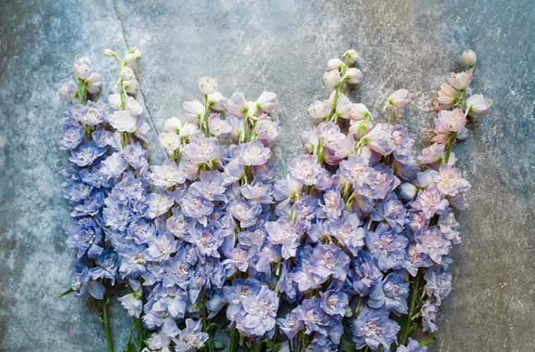
Very Peri, the Pantone Color of the Year 2022, encompasses the qualities of the blues while simultaneously possessing a violet-red undertone. “The Pantone Color of the Year reflects what is taking place in our global culture, expressing what people are looking for that color can hope to answer,” notes Laurie Pressman, vice president of the Pantone Color Institute. “Creating a new color reflects the global innovation and transformation taking place. As society continues to recognize color as a critical form of communication, and a way to engage and connect, the complexity of this new red-violet–infused blue hue highlights the expansive possibilities that lay before us.”

Very Peri is a color that aligns nicely with the coastal towns on the North Shore. We rounded up a few experts to share their thoughts and insights on how to incorporate the color in your home and life. Here’s what they had to say.

Versatile coastal vibe

Sandra Sigman, Les Fleurs

Sandra Sigman of Les Fleurs has seen Very Peri popping in weddings on the coast, noting that it evokes a beachy feeling. Seeing its beauty in tweedia flowers, she comments that it looks lovely with white posies and eucalyptus. She paired tweedia with navy-blue candles, flowers with white tones, and pampas grass at a Newport wedding and incorporated it with oyster-shell salt and pepper shakers at a wedding at the Beauport Hotel. Sigman also sees Very Peri in the lavender she imports from Provence, which looks lovely dried and bundled in a vase. 

A stone pattern takes the hue of Very Peri. 

Obsessed

Renee Terry, Sweet Cheeks by Renee

“I’m not surprised at all about Pantone’s Color of the Year selection, I’m already obsessed,” notes baker Renee Terry, owner of Sweet Cheeks by Renee. "As a cookie artist, I love seeing what the selection is going to be so I can prepare for my wedding orders in the coming year. I love to pair and complement colors and tones in my cookie sets, so I am excited to see what blends I will get to achieve using this Very Peri color,” says Terry who is the winner of Food Network’s Christmas Cookie Contest.

Works in many settings

Lucy Dearborn, Lucía Lighting & Design 

“What a pretty color!” exclaims Lucy Dearborn, owner of Lucía Lighting, who notes that people are gravitating to colored lighting to create a mood. She sees a Very Peri table lamp looking resplendent in a neutral room and a huge drum shade hanging brilliantly in an all-white room. “Very Peri can work well in a lot of settings,” says Dearborn who predicts that Pantone’s Color of the Year will add a gorgeous color accent as a pillow on a white sofa or as artwork in a neutral room.

A Scandinavian-style kitchen takes on the bold color. 

Very Bold

Gina Baran, Gina Baran Interiors + Design

“Very Peri is very bold,” interior designer Gina Barn proclaims. “It is not a color we would typically gravitate toward, but we would challenge ourselves to incorporate it in the right setting. I could see this color used in a bathroom vanity, a pool bath, an accent pillow, or even an unexpected ceiling pop in a vacation home in the Florida Keys or the Bahamas. Blending the color with a warm white and brass tones could modernize it a bit.”

Great pop of color

Mindy Sevinor, Designer Bath & Salem Plumbing Supply

“Pops of color are being incorporated into bathrooms more and more frequently,” says Mindy Sevinor, showroom brand manager at Designer Bath, who says her team is seeing tubs and/or vanities integrated in the design scheme as a bold highlight. “In some instances, people can pick from 3,500 colors offered by Benjamin Moore and completely customize their tub and/or vanity. This addition of dramatic color serves to vault the piece into a starring role in the overall décor.”

Unique

Jessamyn Anderson, Dingo Creative

“What a beautiful addition to the Color of the Year,” says Jessamyn Anderson, co-owner and web-design director at Dingo Creative. “This color is unique. It pairs well with neutrals, such as taupes and creams. With the cool and warm hues, this color will be a beautiful addition to so many interior design and home furnishing brands and websites. It will set these brands apart as being daring and confident, but warm.”

Wall paint is another way to punch up the color in your home with this on-trend hue. 

Such a happy color

Nancy Boughton, Nancy Boughton Designs 

“I absolutely love Very Peri,” says Nancy Boughton of Nancy Boughton Interiors. “It’s such a happy color. I think it pairs well with green as well as neutrals. It’s also a great blue for beginners who may be hesitant to use an intense blue. Very Peri would be gorgeous in a bedroom with white or neutral wood furnishings. It would also work well in a bathroom, in a hallway, or in accessories like pillows or throw rugs.”

Popular vibe

Pam Older, Pam Older Designs

“Designers will use tanzanite, natural and dyed chalcedony, sapphires, and amethyst to create the mood of Pantone’s Color of the Year. It’s been a very popular combination for us paired with darkened silver to create a moody look,” says Pam Older of Pam Older Designs. “I use shades of indigo, periwinkle, violet-blue, and even a spark of turquoise to invoke a rich gem quality and create the mood with dark silver. When used with gold these stones become brighter, equally beautiful but not as unique.”

Lovely

Brooke Carroll, Lark Fine Foods

“The color is lovely and would fit well on the North Shore," says Brooke Carroll, principal at Lark Fine Foods, who notes that the color is similar to the Pantone hue they have been using on their Salted Rosemary Shortbread for more than 10 years. “For that reason, you are not likely to see it featured here at Lark.”