Subscribe Now


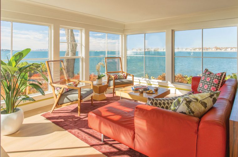
Ten years ago when Jill and Scott Sullivan first bought their dream house at the water’s edge in Swampscott, they renovated the house—top to bottom. “Our three children were small then,” Jill Sullivan says. “And so we made compromises, some of which did not work out so great.”

She and Scott knew that eventually they would renovate again, but they were unsure as to how and where. They felt that the spectacular views offered by the site were lost within the house, and they wanted better function for a busy family in many of the downstairs rooms.

“The dining room used to be a way station between the living room and the kitchen,” Sullivan says. “And we had a room we never used—it was too hot in summer and too cold in winter. It became an attic,” she adds. “A place to store things.”

An inveterate walker, she saw a recent building project on one of her journeys that spoke to her aesthetic. When she approached the homeowners to ask who had designed it, they pointed her to Siemasko + Verbridge, the architecture and design firm with offices in North Beverly and Chatham. She met with Jean Verbridge, and the two launched into a renovation project that fixed all the problems and then some. In the process, they formed a partnership that each remembers fondly.

 “This is a traditional center-entry Colonial home on a circular drive, with great views,” Verbridge says. “The site is very exposed, so the seaward-facing bays at the ends of the living room and the kitchen breakfast area were suffering water damage and needed some work.

“We replaced the windows in those bays with new ones that have much thinner muntins, to greatly increase the view. They are in big squares, to keep to the traditional look of the house.” She designed pockets behind fascia boards that hide blinds. “When there is this much light, we have to deal with glare.”

She transformed the “attic room” into a warm and welcoming family retreat that has become the TV room for the whole family. The formerly forlorn dining room is freshly functional via a new half wall that opens to the living room. “We have used the dining room more in the past year than we did in the past 10 years put together!” Sullivan laughs.

In the kitchen, Verbridge added seating with a deep window seat in the bay that houses the breakfast table. She utilized the same design trick in the family room, where two gray sofas flanking the fireplace are augmented with a long cushioned seat on the window wall.

“Now we can all sit out here, along with friends, and there’s plenty of seating for all,” Sullivan says.

When the television moved to the family room, the bay window end of the living room changed direction. “We used to watch TV there, and so the orange sectional sofa faced the wall,” the homeowner explains. “The moment we turned it around to face the view, the room came alive.

“In each room, we made a single improvement so that it works for us. Scott says that, just by gaining the use of the family room, we have doubled the size of our house.”

The newly useful downstairs rooms got a powerful infusion of personality from the lively color scheme Sullivan favors. “One of the great things about Jean,” says Jill Sullivan, “She looked at my house, and she got my aesthetic right away.” Over the years, they have collected art that they love and decided to let that art drive the color choices for the rooms.

“She has such a great approach to color,” says Verbridge. “So many people think that, when you have the intensity of the ocean right outside the windows, you have to tone down the interior in subservience. But Jill wanted to balance the strength of those blues with strong hues.

“Neutral colors are easy,” she adds. “But these are so much more rewarding!” The living room walls wear a shade approximately the color of limeade, a little closer to green than yellow. The fireplace wall is painted gray, the same color as the new half wall leading into the dining room. A soft mauve-purple is on that room’s walls; to the other side is the living room, an unapologetic orange.

“The green and orange are complementary,” Sullivan says. “And this purple looks great with them. I really love these colors: They flow together and complement my art. The rooms are cheerful, with a lot of life and energy. They suit us—we are energetic people.”

“The day the paint colors went up was my happiest day of the whole project,” she adds. “I have never had a moment’s regret. I love this home!” The colors are an effective foil for her pared-down, contemporary furniture and simple, tchotchke-free décor. As Verbridge says, the rooms balance the drama outside.

“But nothing competes with the ocean,” Sullivan says.


Siemasko + Verbridge

126 Dodge St, Beverly, 978-927-3745

svdesign.com